National Geographic
OceanXplorer
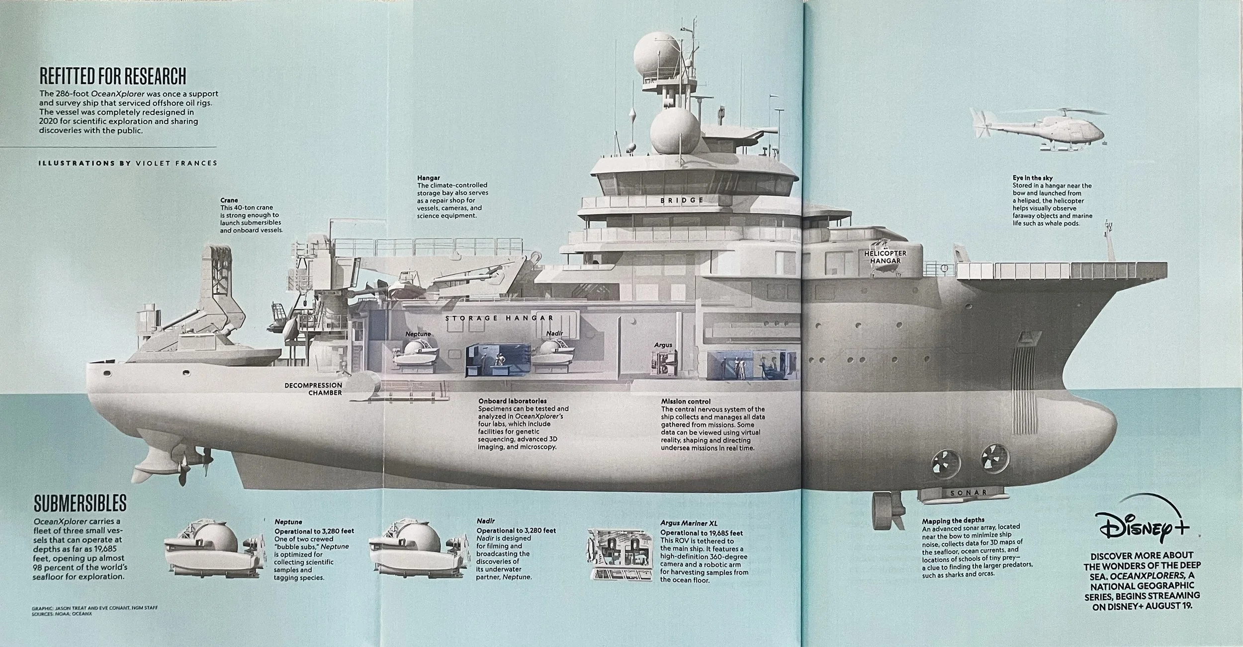
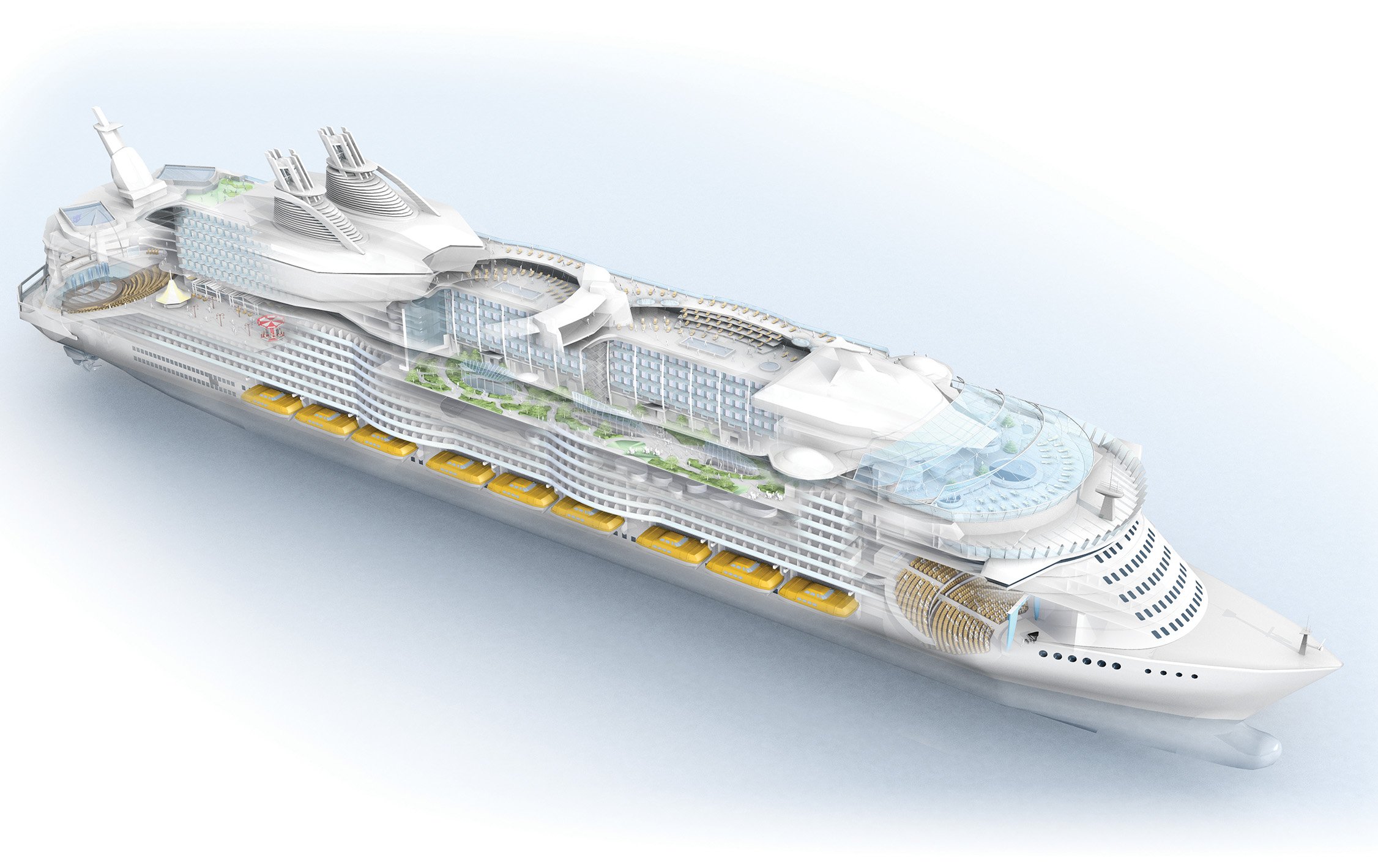
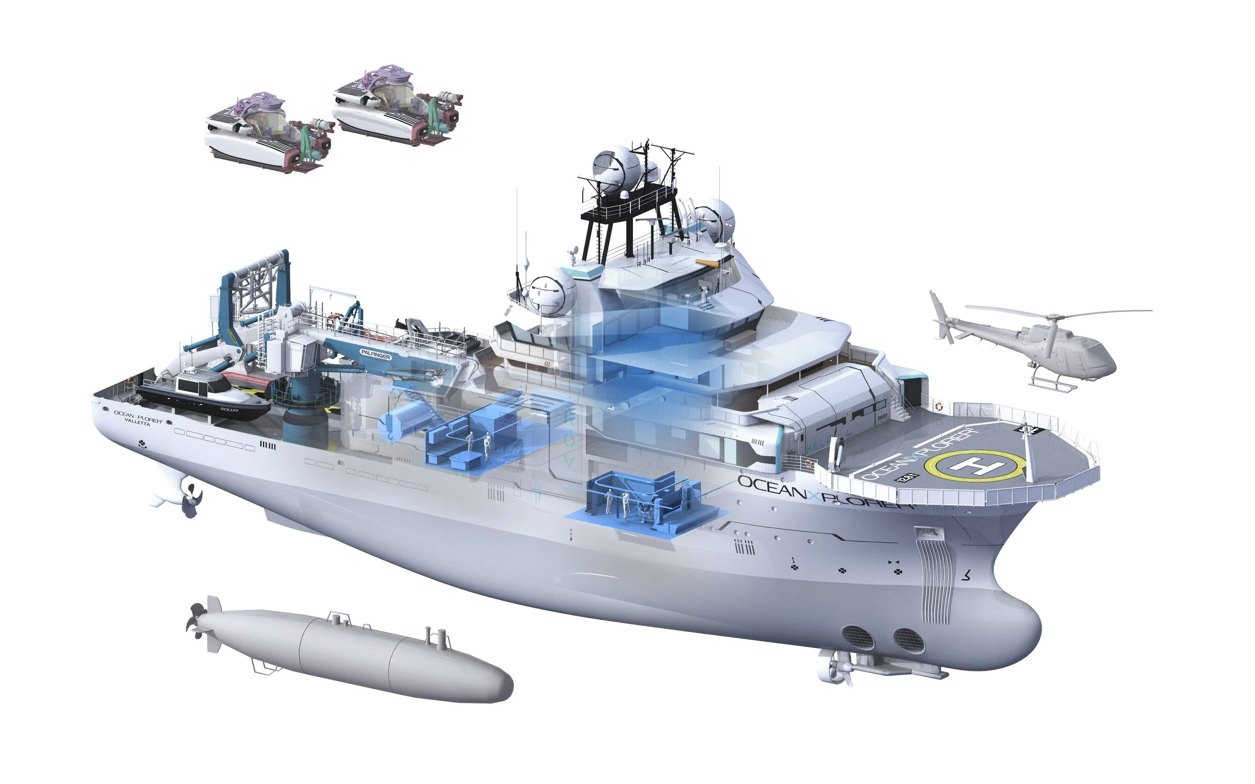
Jason Treat contacted me in 2025 to work on a gatefold: a cutaway illustration of OceanXplorer, a petroleum support and survey ship refitted and refurbished for deep-sea research and exploration. The first project I had worked on with Jason, back in 2009, was of the world’s largest cruise ship, for The Atlantic magazine. So we were no strangers to maritime travel and illustration. (This illustration was done back in the Bryan Christie Design days. It was one of the first pieces I worked on with the indomitable Joe Lertola, whom I had the great good fortune to hire after TIME Magazine — in a real boneheaded move — cut him loose.)
Jason sent me reference and photos:
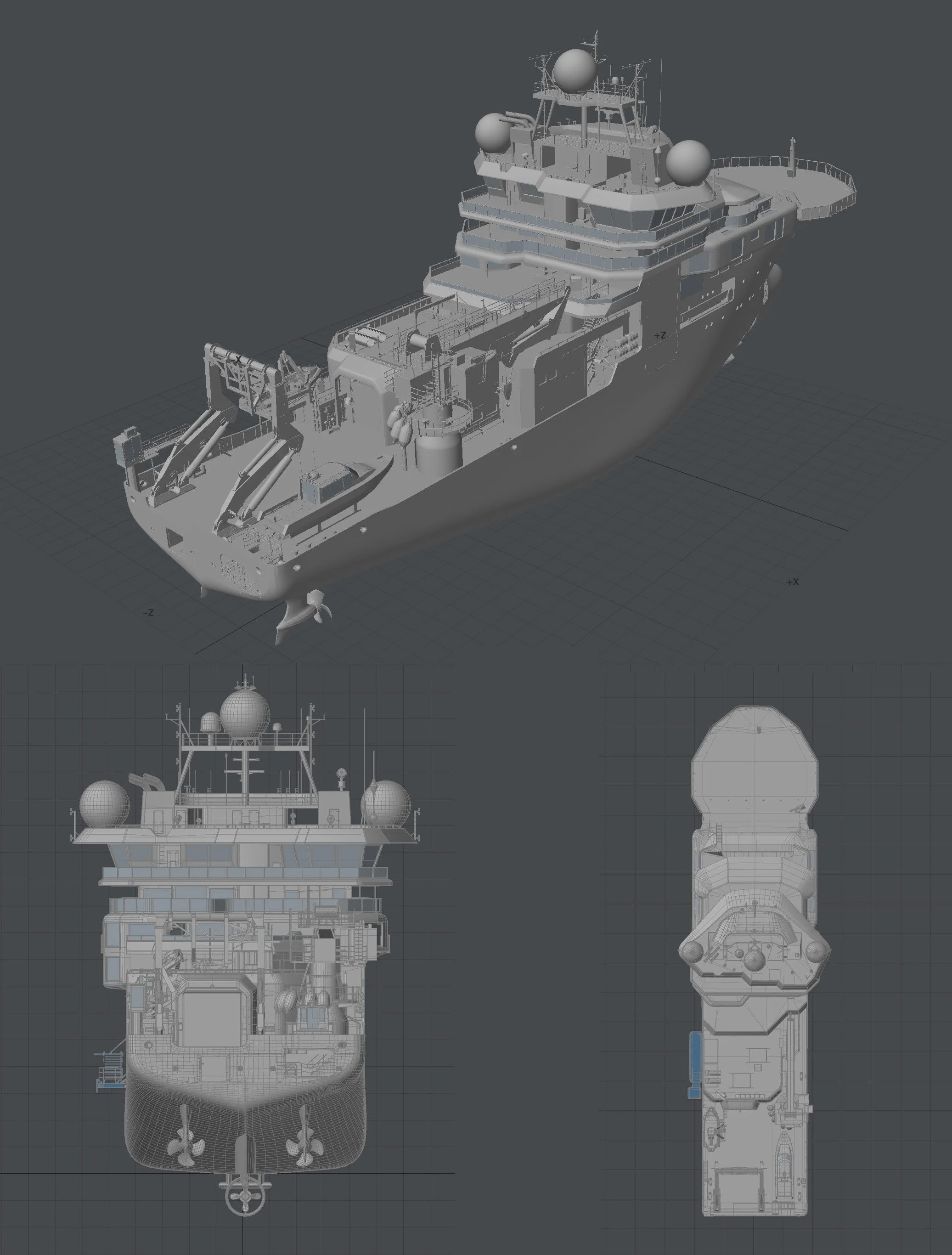
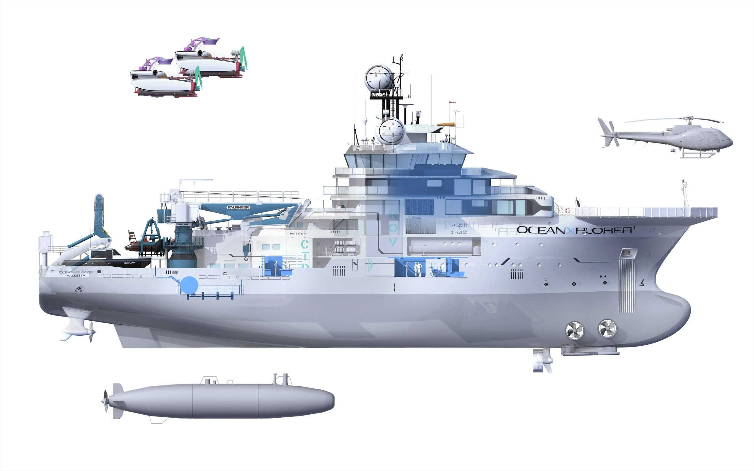
We initially discussed showing the boat in a three-quarter view (like the previous boat we did for The Atlantic). I put together a sketch and sent it:
Something was bothering me, and it took a minute to realize what it was. 3D is seductive. The possibilities are seemingly endless. Endless reflections, endlessly dramatic perspective, shadows upon more shadows! It’s easy to be seduced, and over the years I’ve found that “less is more” can be applied to great effect and is a great rule of thumb for working in the 3D medium.
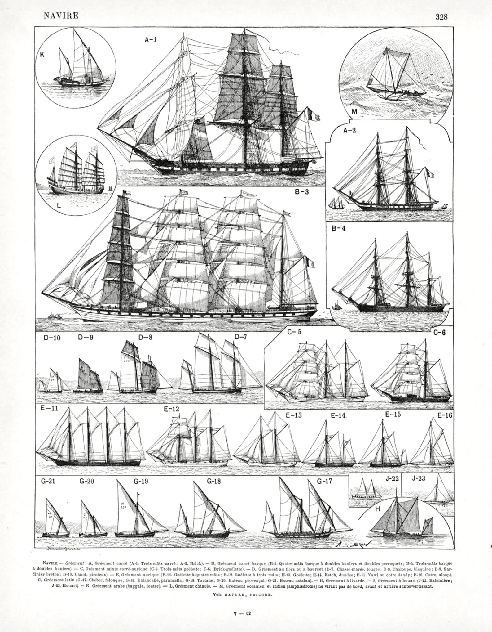
There’s a beautiful history of nautical illustration that I felt we weren’t drawing from or even respecting in this three-quarter view. These old illustrations are some of my favorites. These side-view, or “elevation,” illustrations are clear, elegant, and in them, the ship’s geometry — nearly completely function over form — is very apparent:
I called Jason (yes, sometimes I use a phone!) and told him what I was thinking about. He liked it — and was reminded of a scene in the Wes Anderson film The Life Aquatic.
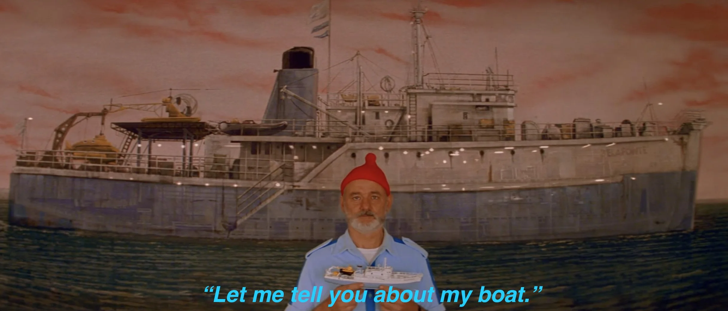
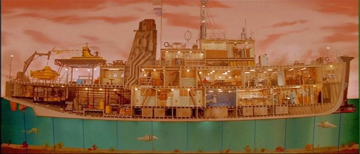
From that moment on, the project was referred to as “Let Me Tell You About My Boat.”
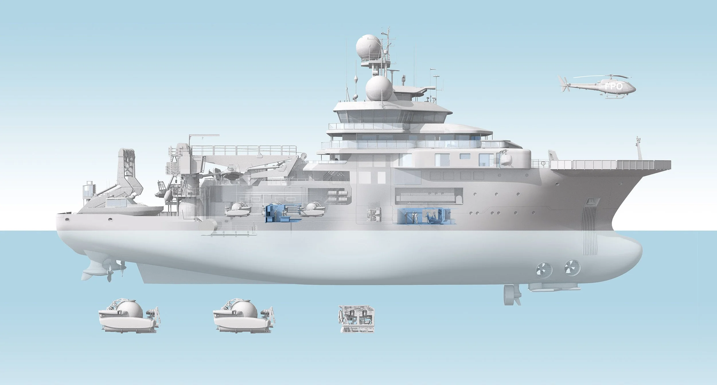
After the conversation with Jason, I put together another sketch and sent it to him:
Closer. But something was still bugging me. It still felt too much like a 3D rendering. The contrast felt too strong, and did we really need all those logos? I also wanted the whole piece to be a bit more, well, quiet. Here’s the next round I sent:
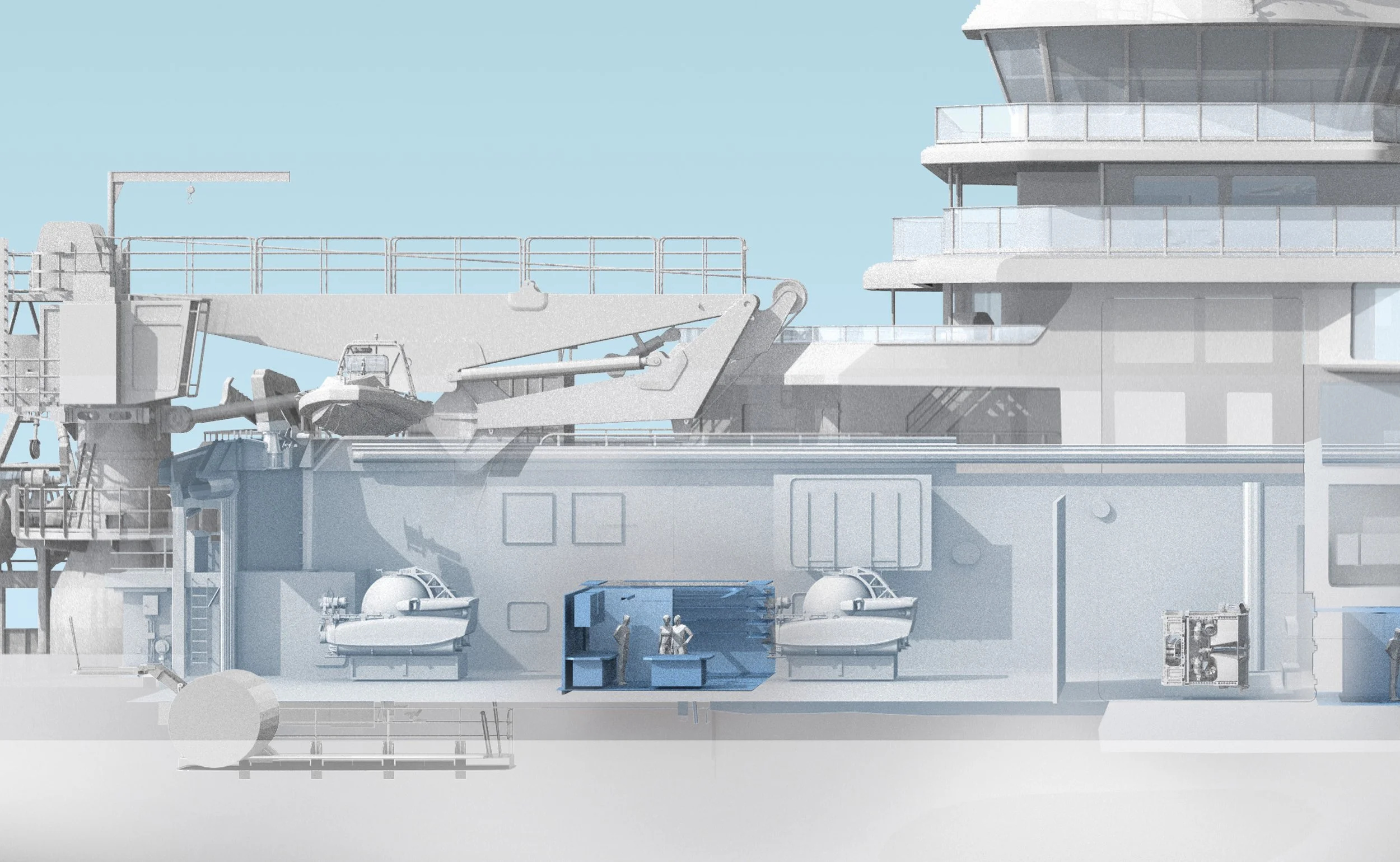
And a detail:
After making some tweaks to the blues and adding in more details, I sent the final. And here’s how it appeared in Nat Geo: