
A Cover About the Second Quantum Revolution
In March 2026, I was delighted to receive an email from Jen Christiansen, senior graphics editor of Scientific American, asking if I was interested in doing a cover illustration on quantum computing for the June 2026 issue. Looking over the brief she’d sent, I was struck by this image of SciAm covers from the past:
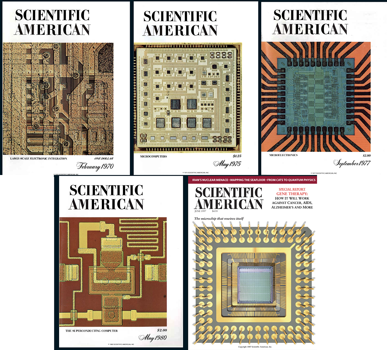
I laughed when I saw it; the bottom right cover, from June 1997, was done at Slim Films while I was interning/working there. Yes, as of this writing, that’s 29 years ago. A former life, indeed.
Jen’s email included a rough layout and a brief description of what she was hoping to achieve:
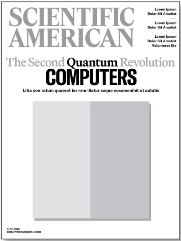
She wrote, “I’m imagining something rooted in a classic microchip on the left, and a quantum computing chip on the right, with overlays and details on the right that highlight the quantum nature of things. OR, a classic CPU breaking away and dissolving into representations of qubits.”
Later that day, as Jen and I discussed the cover over a Zoom call, the room began to go a little sideways as I became reacquainted with those odd and mysterious old friends: Qubits. Superposition. Entanglement. Spin. Multidimensionality. That undead cat.
It culminated when Jen mentioned the “quantum nonbinary” and I blurted out, “Quantum mechanics is queer as fuck!” When we composed ourselves after having let the work call devolve into a giggle fest, Jen said with a sly smile that the qubits are often depicted in baby blue (representing “1”) and pink (“0”). Coincidence? I think not! 🏳️⚧️
The second most important takeaway I got from the call is that the cover illustration should be rooted in the history of computing, as covered by SciAm, but somehow made fresh, and seen through a quantum lens.
As I considered the cover after our call, a French artist I had recently been checking out — Pol-Edouard — came to mind.
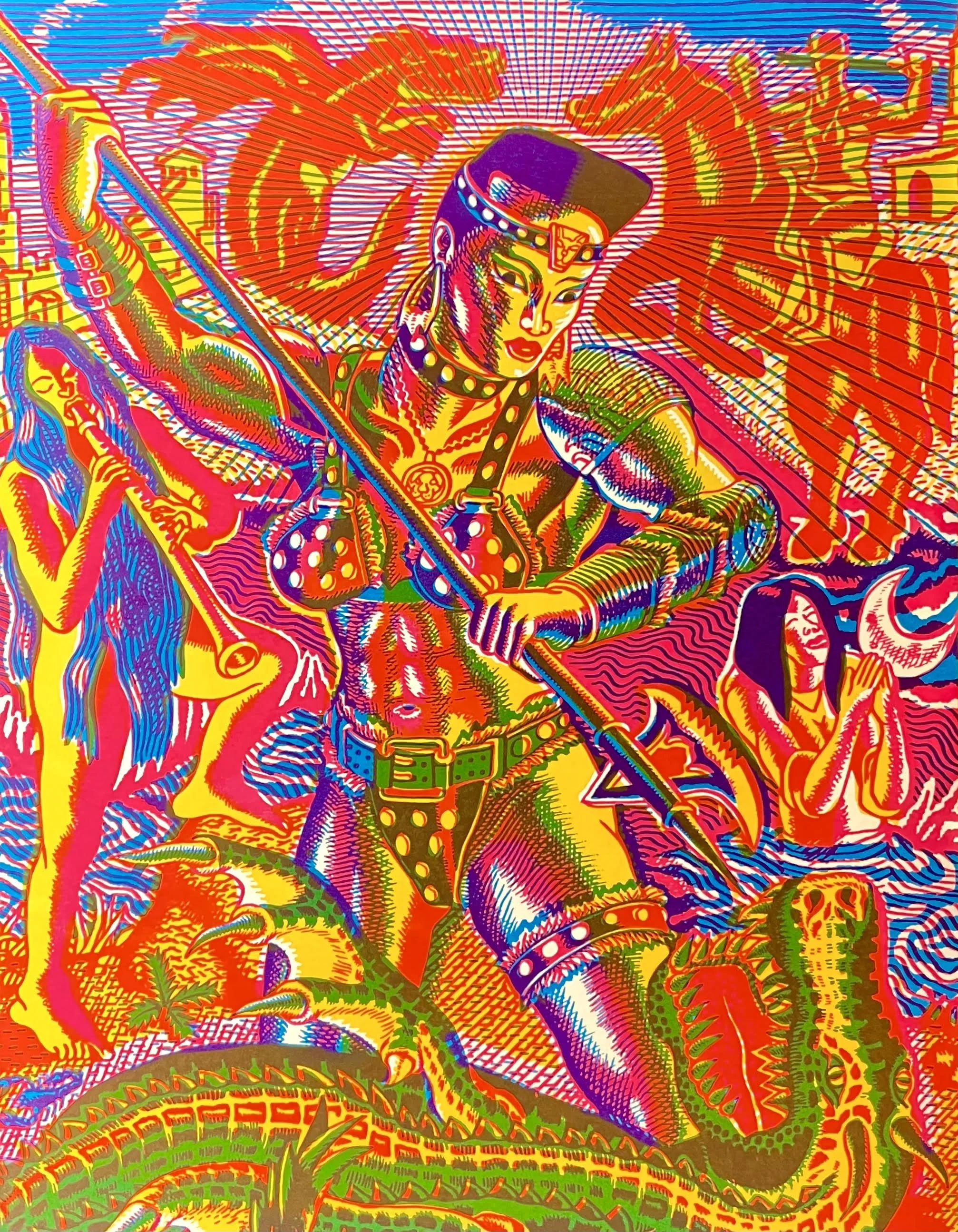
Saint Georgette and the Dragon (Copyright © Pol-Edouard, 2022)
Behold Grace Jones from the 1984 movie Conan the Destroyer, garbed in a costume from 1982’s The Road Warrior, reenacting Saint George slaying the dragon. The freewheeling mashup of ’80s pop culture and Renaissance painting, the use of 16-pass screen printing to re-create the four-color process, and the surprise of seeing these disparate elements together is exhilarating. I love the way he uses things most people are familiar with and, in the collage-like combination of these elements, makes something quite new. Obviously, stylistically and content-wise, worlds away from the commission I was hired for. But I thought there was something in Pol-Edouard’s process that I could take a page from.
Italian Futurism from the early 20th century also kept coming to mind. There’s something about its glinting, glittering, hard-edged optimism seen fractured through a multidimensional lens that felt related to the quantum world and the mood I thought Jen hoped the cover would convey.
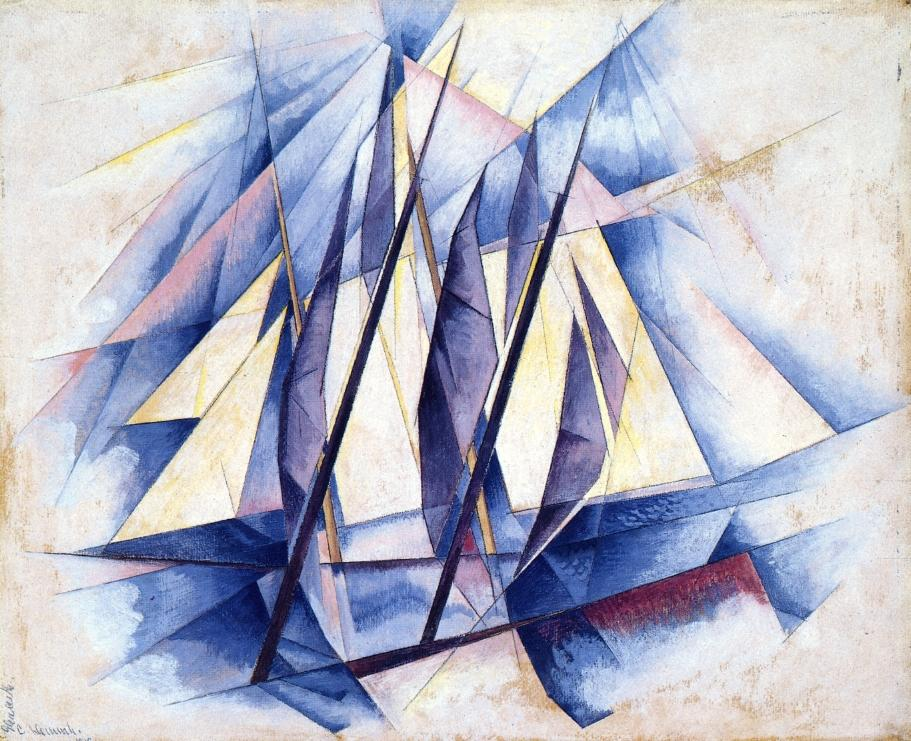
Sail: In Two Movements (1919) by Charles Demuth
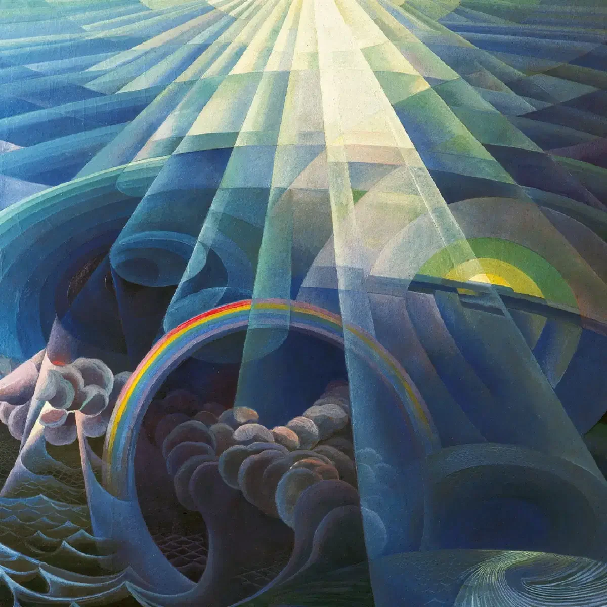
Volo sull-oceano (1929), by Gerardo Dottori
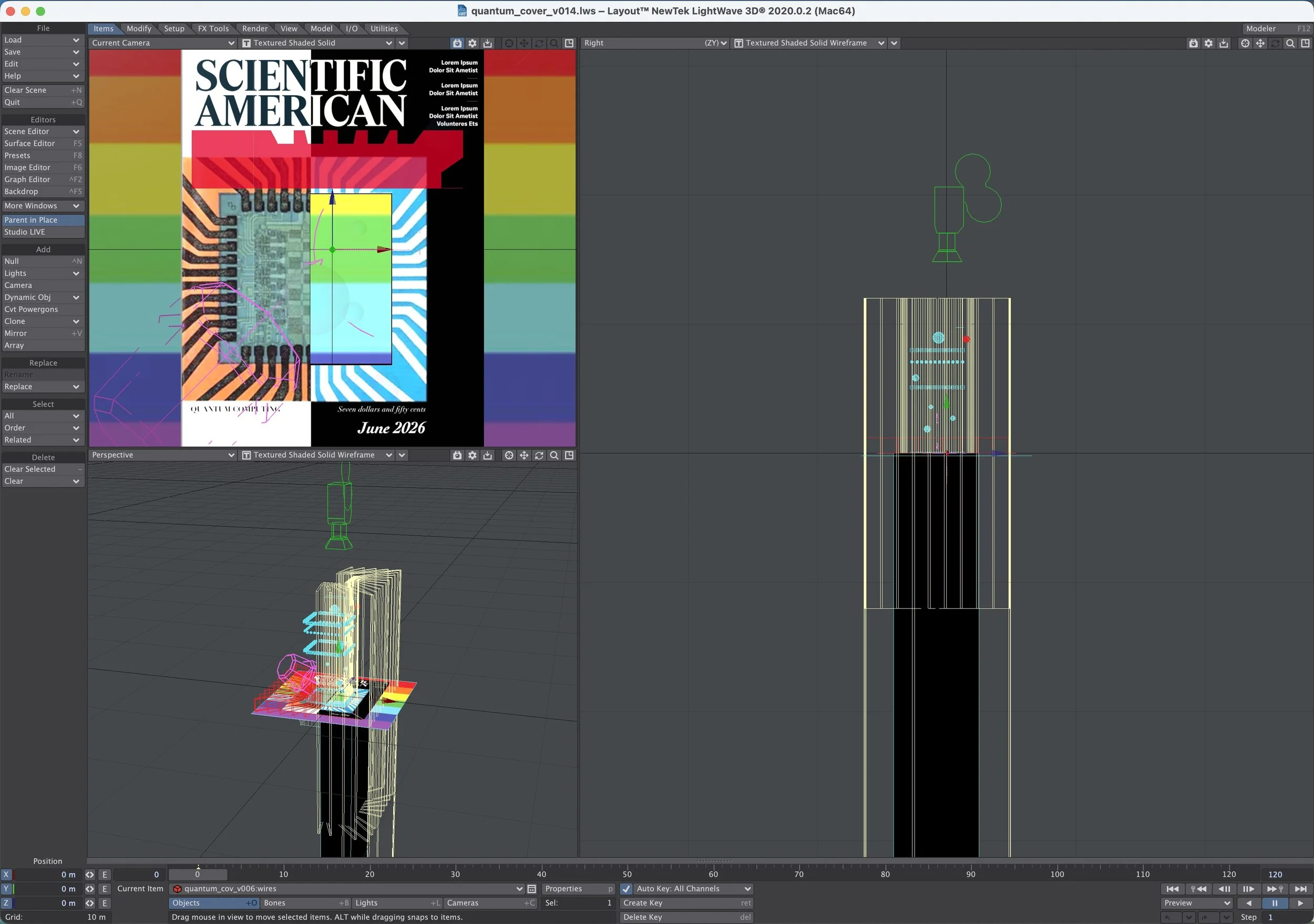
After letting it simmer for a while, I focused on the task at hand (as I understood it at that moment): re-creating an old cover of SciAm from the ’70s and updating it through a quantum lens. I started by redrawing one of the old covers and, in a digital 3D environment, used transparent, reflective, and refractive polygons to create a fractured effect. This is how the scene was set up in my 3D software:
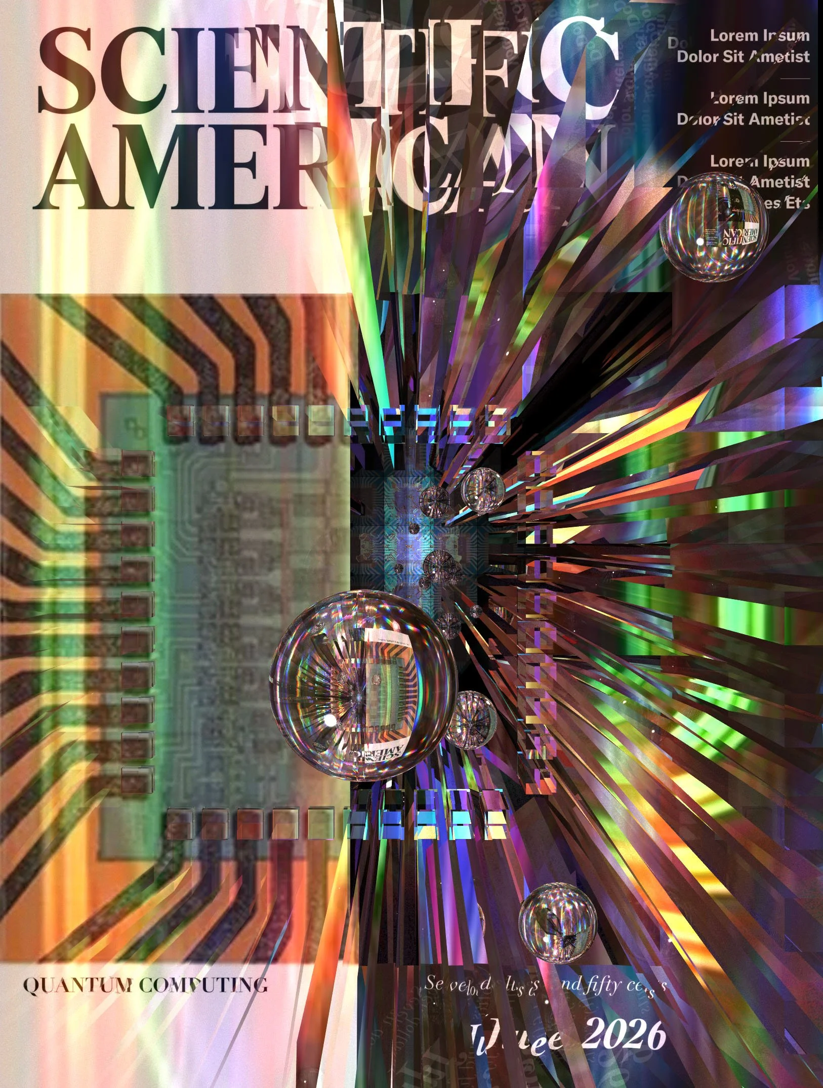
And here’s the initial sketch I sent Jen. For those interested in the technical side of things, none of the fracturing and lighting effects on the right side of the sketch below were “painted” in Photoshop. It was all done in-camera in 3D software using transparency, refraction, and reflection:
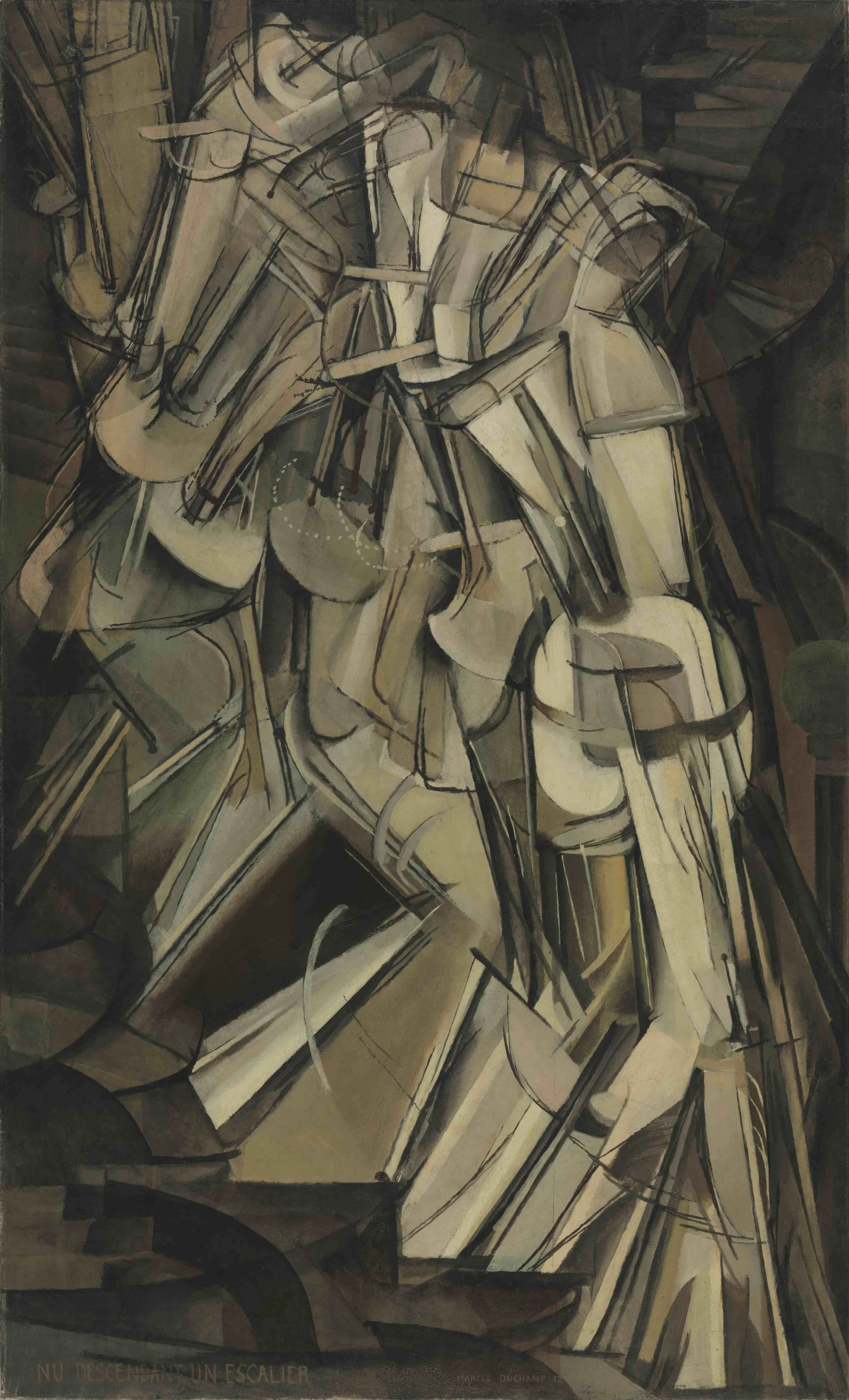
It turned out to be a swing and a miss, but in Jen’s email reply, she reminded me of the illustration I had done for her the previous month on the dwindling orbit of the Swift satellite. We had dubbed this piece “Nude Satellite Descending a Staircase” because of its similarities to Marcel Duchamp’s 1912 painting Nude Descending a Staircase (No. 2):
I had been so focused on deconstructing the aesthetics of the old Scientific American covers, interpolating the old into the new, that I had not appreciated that Jen had mentioned the “Nude…” a couple of times on our initial call.
So here’s a bit of a tangent about the thought and process behind “Nude Satellite Descending a Staircase.” These days, something looking “real” or “photographic” has become quite cheap and even meaningless — an inevitable result of the onslaught of AI-created imagery. I’d been ruminating a lot about how I could respond as an artist to this age of empty, artificial “realism.” And something about line work kept coming up for me. So when Jen commissioned me for the satellite illustration, I sent her a line illustration I had done earlier that year and asked if she’d consider an illustration done in this style:
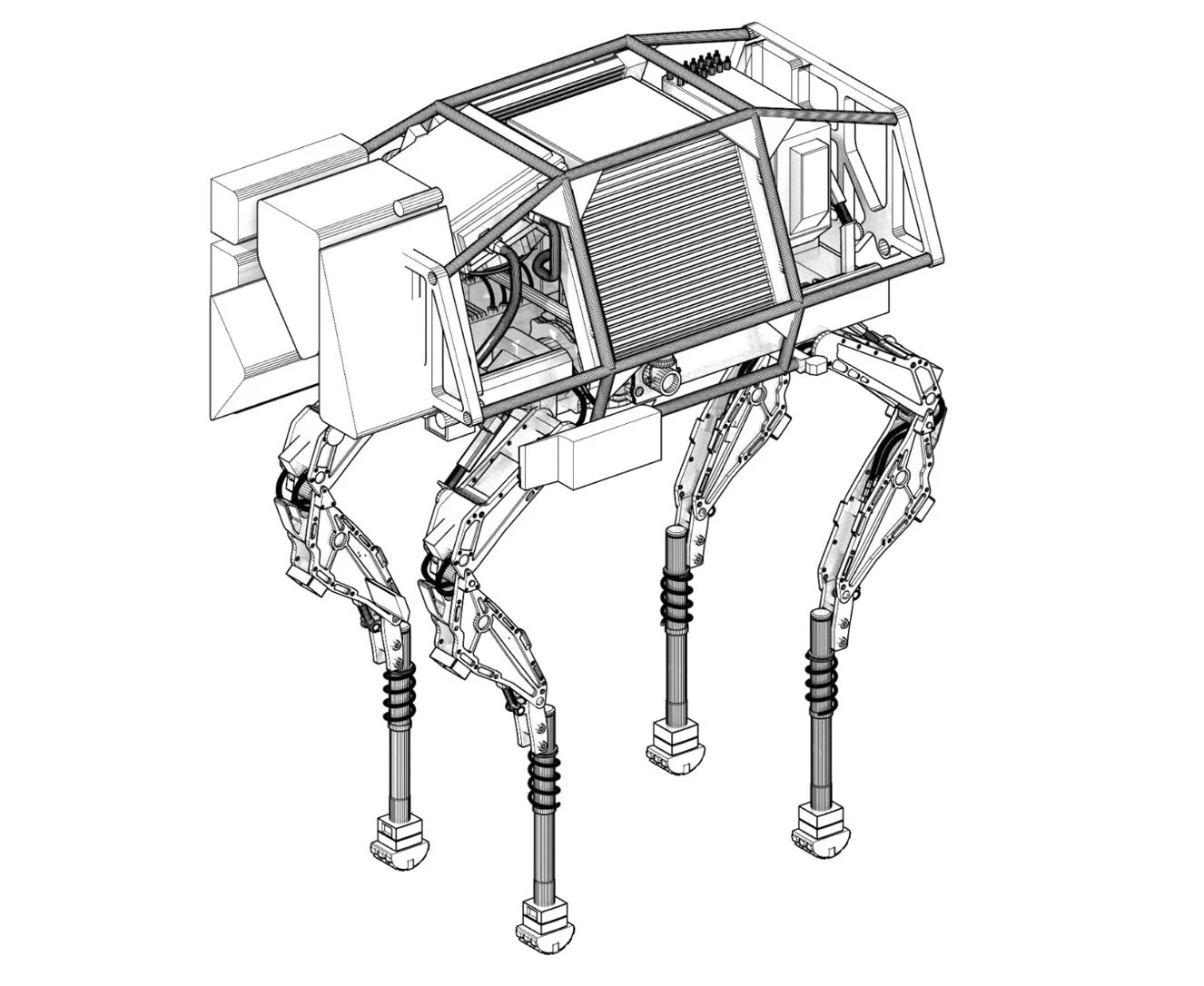
Her reply: “Go for it!”
Happy that Jen was game, I read the story that the illustration was going to accompany, and the opening lines of Meghan Bartels’ article caught my eye:
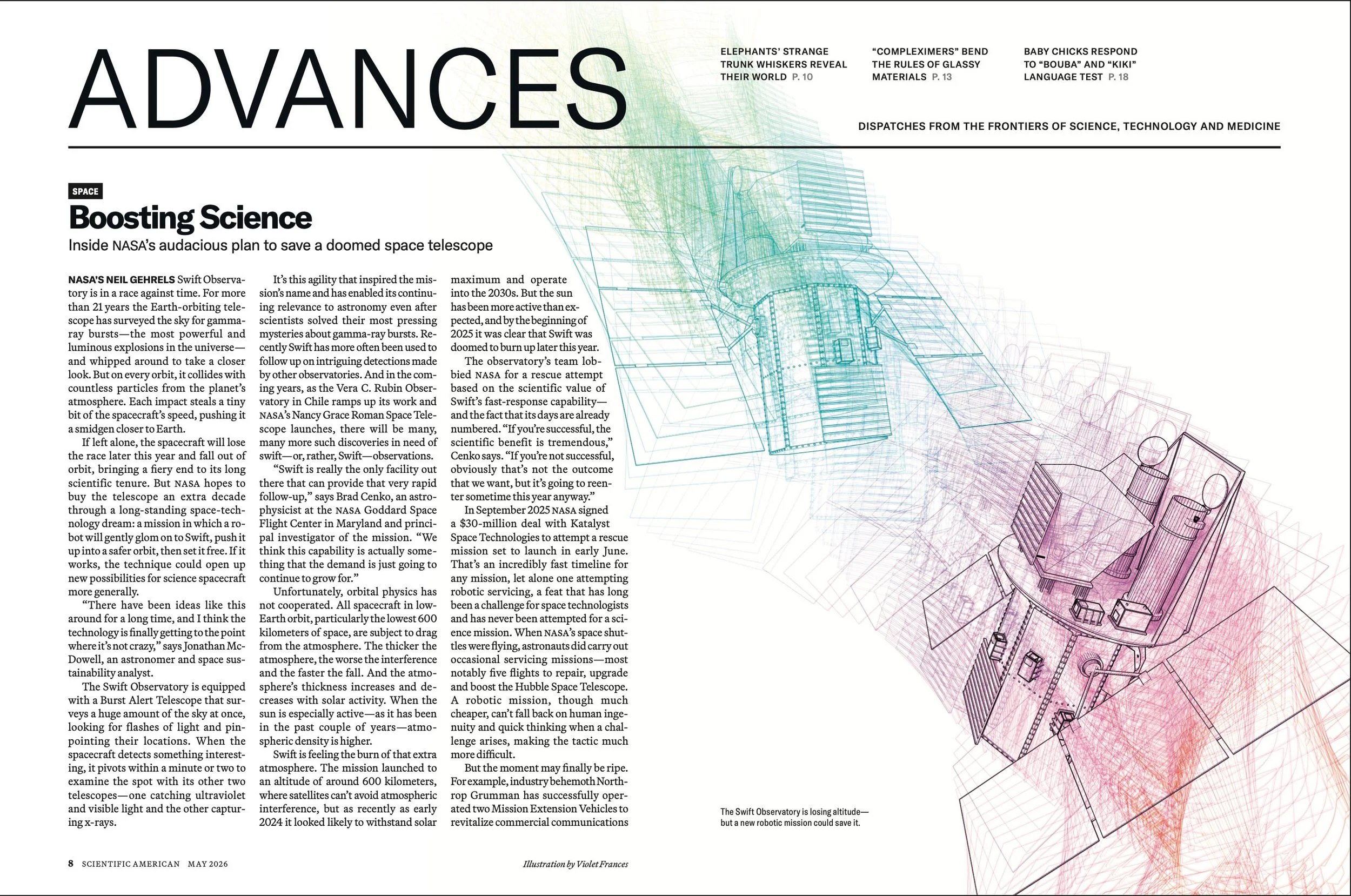
NASA’s Neil Gehrels Swift Observatory is in a race against time. For more than 21 years, the Earth-orbiting telescope has surveyed the sky for gamma-ray bursts.... But on every orbit, it collides with countless particles from the planet’s atmosphere. Each impact steals a tiny bit of the spacecraft’s speed, pushing it a smidgen closer to Earth.
If left alone, the spacecraft will lose the race later this year and fall out of orbit, bringing a fiery end to its long scientific tenure.
I wanted to capture the Swift gamma-ray observatory in its descending motion as it goes “a smidgen closer to Earth” with each orbit. I could have done a line rendering of the satellite and simply Photoshopped motion-blur lines onto it, but to reuse a word from a couple paragraphs before, that felt cheap.
I had something else in mind. I kept thinking about the silk-and-encaustic paintings I had done years before. Here’s one from 2014 titled Singular/Plural:
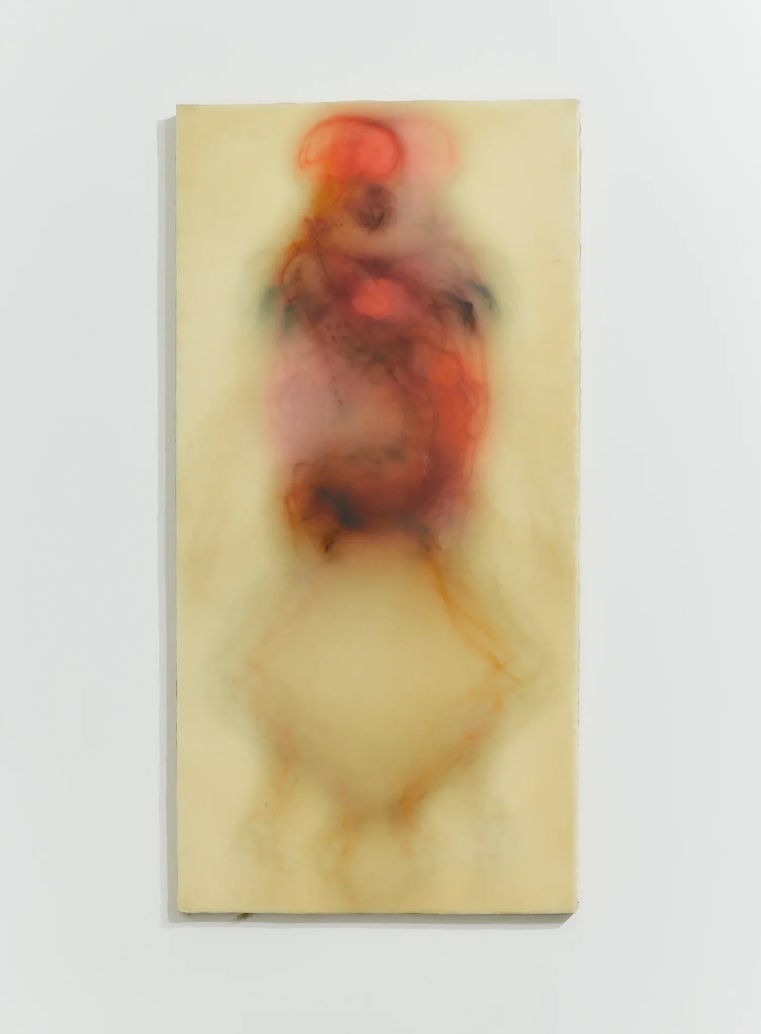
The piece above is composed of 12 layers of silk organza. Each layer of silk is printed with a 3D-derived rendering of a female form, including internal organs. But each of the 12 renderings is taken from a different angle of the figure. I basically put the figure on a virtual lazy Susan and rotate it in increments of 30 degrees. The 12 layers of printed on silk are held together with encaustic, an ancient painting medium composed of beeswax and damar resin. Here’s another example of one them:
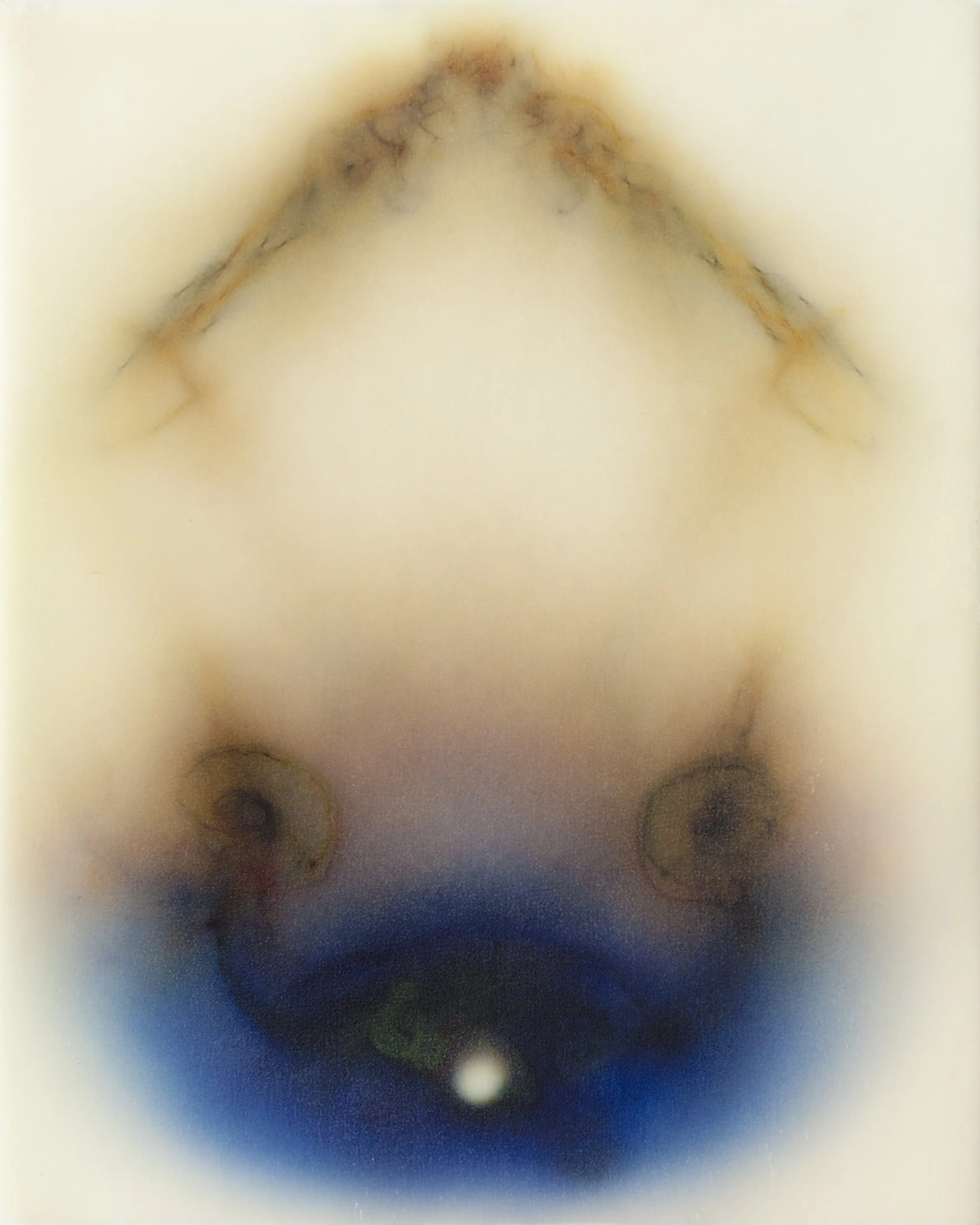
My fine art and my scientific illustration deeply inform each other; neither would exist without the other. For years, I tried to keep them very separate in my mind. In fact, I would get quite irritated, even resentful, when people asked me about my scientific illustration work in gallery and other fine-art settings. But fortunately, I’m seeing them for what they are, two arms from the same person.
Which is all a preamble to this: I wanted the motion, energy, and mystery of the paintings above to be in the illustration.
So I modeled the satellite, set up the 3D scene, rendered a sequence of frames, and sent this sketch to Jen:
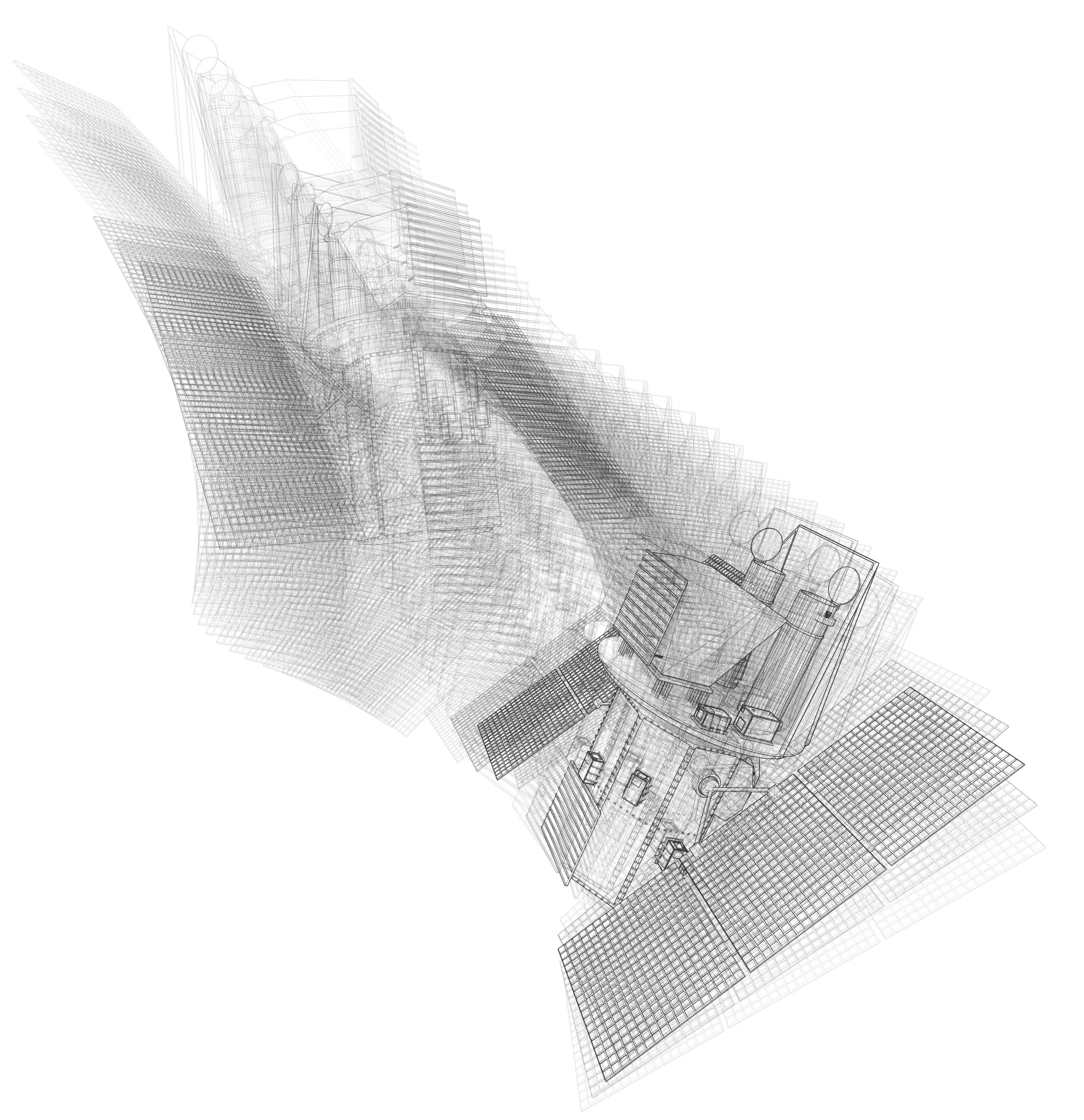
What you see above is a composite of 70 frames of an animation rendered in 3D software. But rather than outputting the frames as a .MOV file so they can be viewed sequentially over time, I’ve put them all together on one still image. It’s an involved process — I’m dealing with technical, mathematical, and aesthetic concerns simultaneously. And it’s hard to tell what it will look like until the renders have been made and composited. Much of it is seemingly up to chance and happy accident. It feels like a strange, digital version of Jackson Pollock drip paintings — there’s a randomness and letting go that I must do even though the process is so precise and mathematical in nature. Here’s the final “Nude…”:
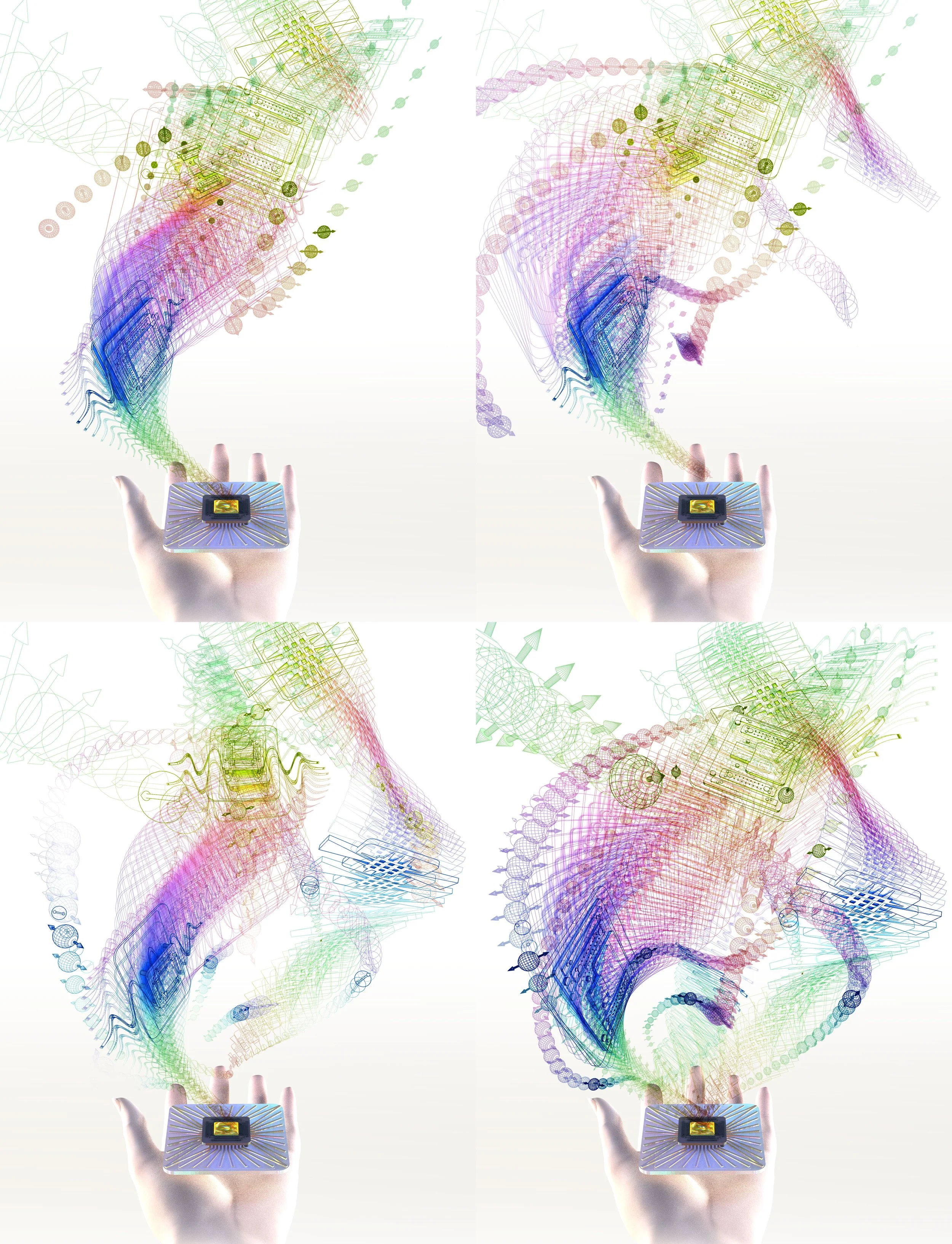
So that’s the process behind “Nude…” — and now let’s return to the actual subject of this case study (the quantum computing cover). I modeled a few computer chips, rendering them over time from multiple angles, and composed them in Photoshop. I sent Jen a couple of rough working sketches:
She immediately got back to me with “Now we’re talking!” Noting that she preferred the white background, she suggested we add some qubits to make the connection to the quantum world more explicit.
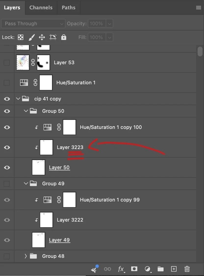
I started working on the additions and revisions, and the number of layers and renders and scenes ballooned:
After a couple of days of work, I sent Jen a few progress sketches:
Jen responded with a mock-up she’d made using a few elements from the sketches I had sent. She asked what I thought.
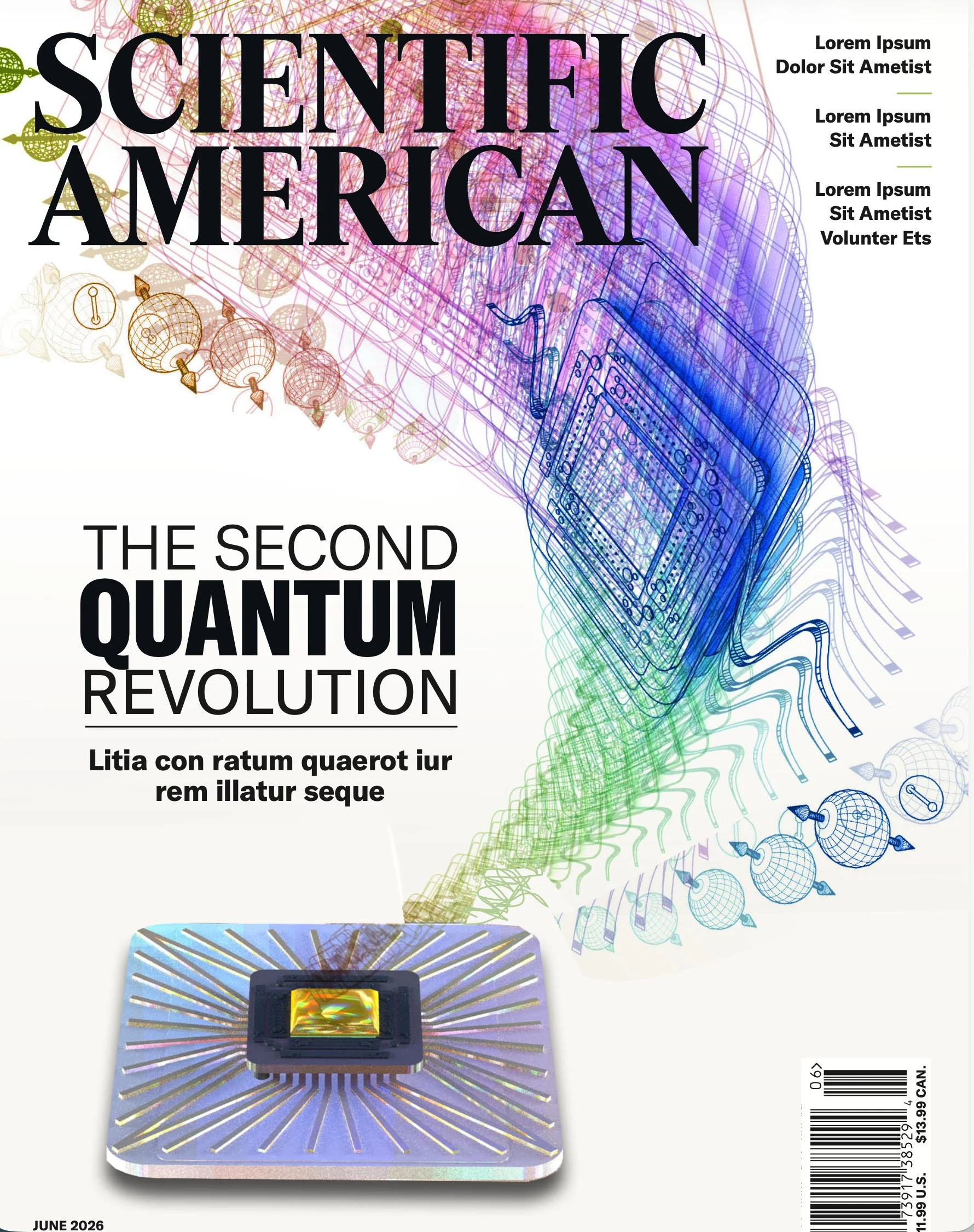
So. There’s this thing called “art direction.” And the humans who do this work have job titles like “art director” or “graphics director.” They exist for a reason. My best editorial work is always a collaboration with them. Always. Nearly every piece and case study I have on this site is the product of a fruitful collaboration.
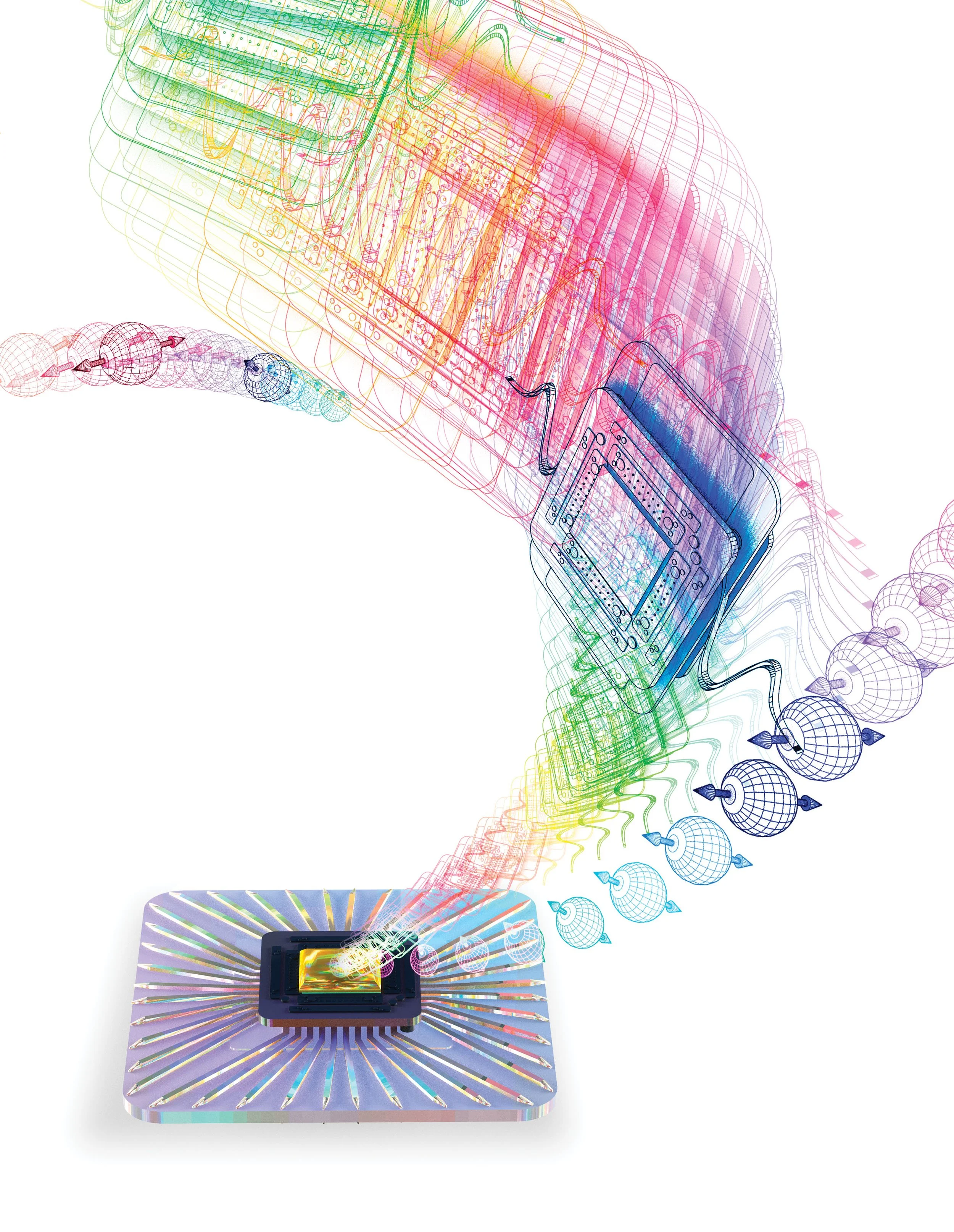
Looking at Jen’s mock-up, I realized the art I was making was already very busy with line and prismatic color, so “killing” the hand holding the chip and keeping the swoop and shape more organized and precise brought more clarity, direction, and drama to the piece. I loved what she had done.
I got to work making final renders, compositing, and doing color correction, and sent her the final:
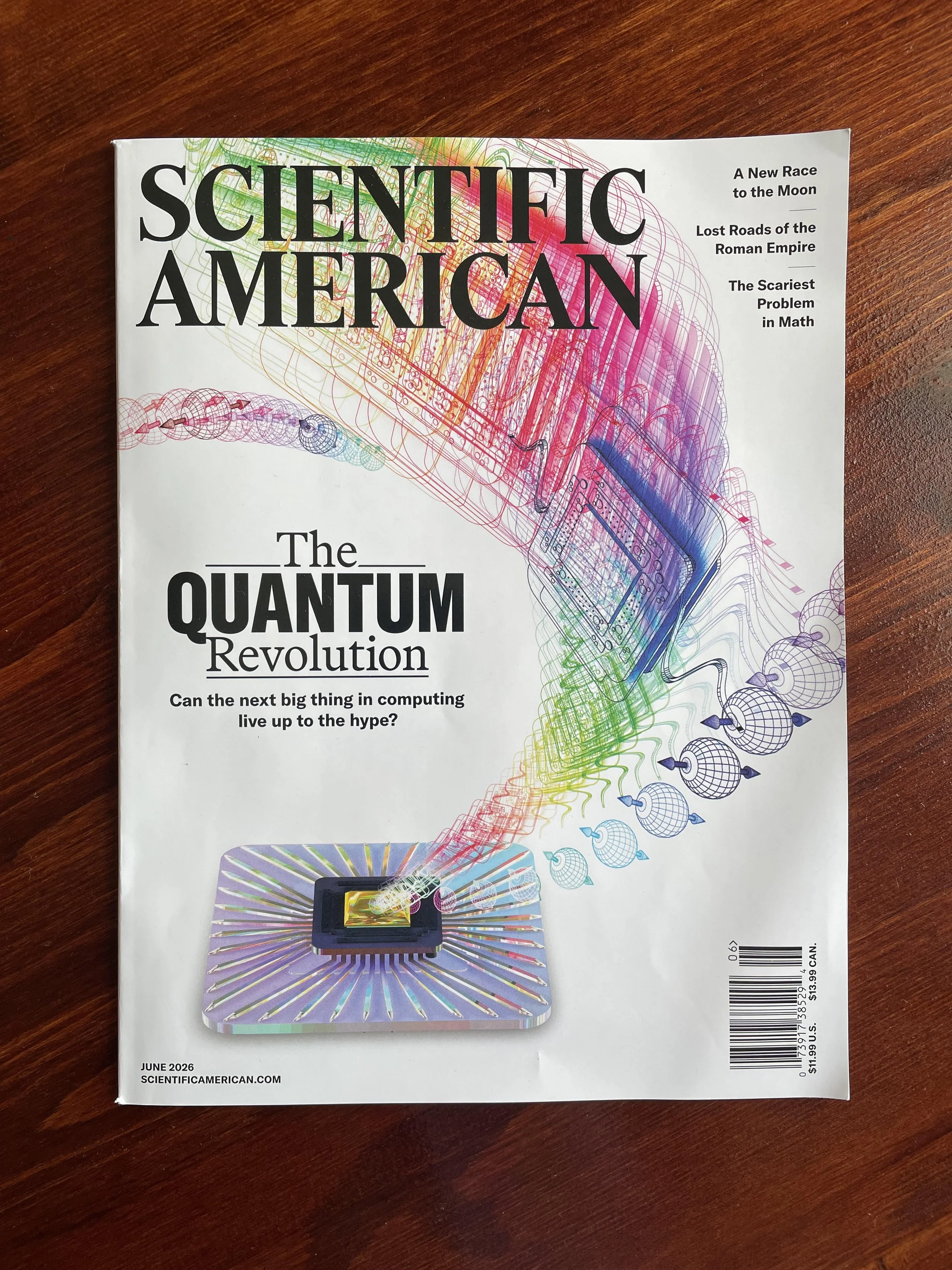
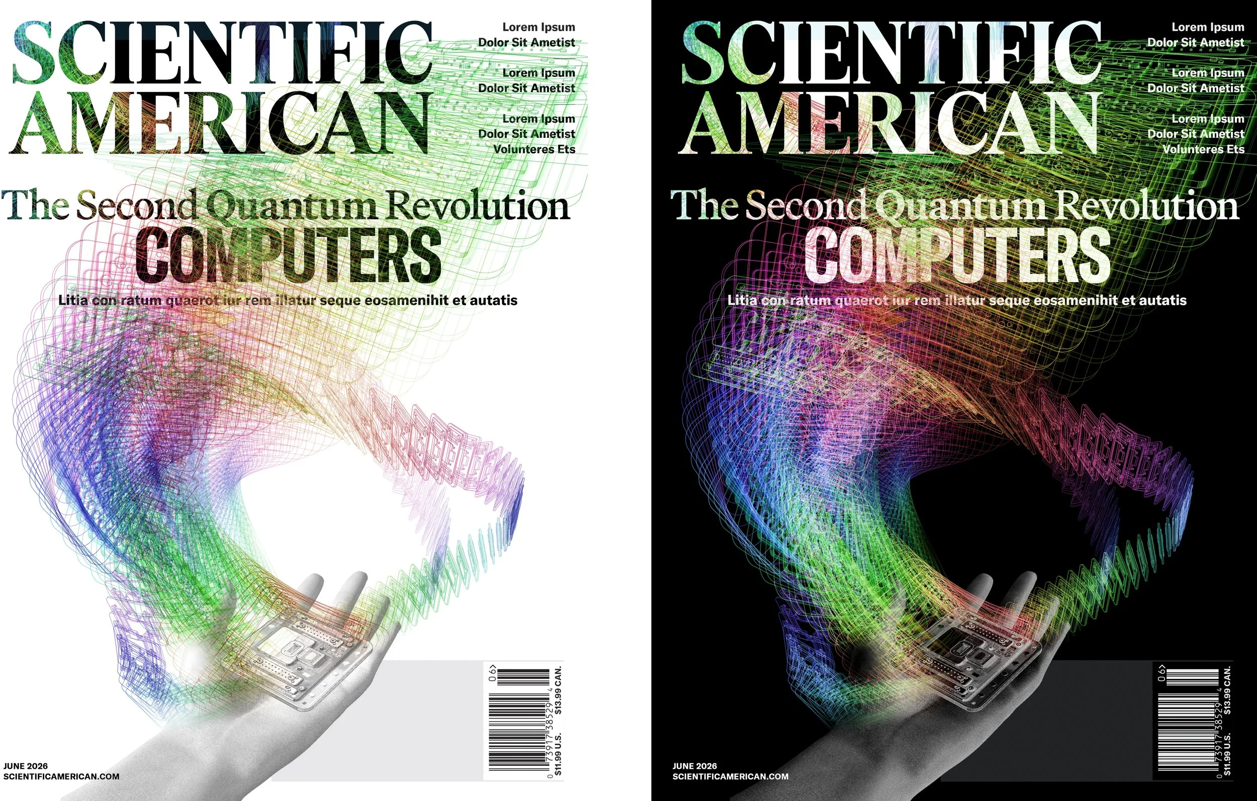
A week after the project was completed, Jen got in touch again to ask if I’d be interested in animating the cover for the magazine’s social posts. Absolutely! Because I had, in effect, already made an animation on the front end in order to create the composited illustration, animating the cover was able to happen quite naturally and without much hitch — it was mostly a question of bringing in the layers of the renders and more or less having them play sequentially over time. Jen and I went back and forth a bit to discuss the speed and how jittery it should be. Here’s how the animated illustration turned out: