Stanford Medicine
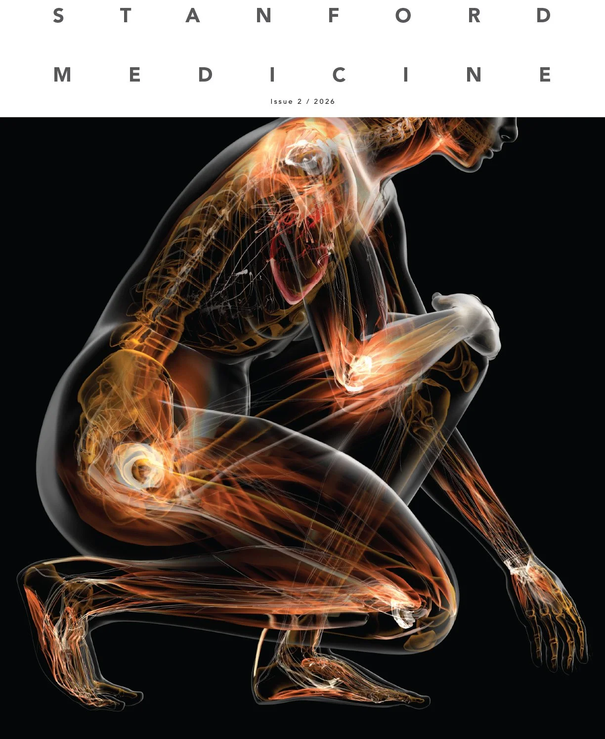
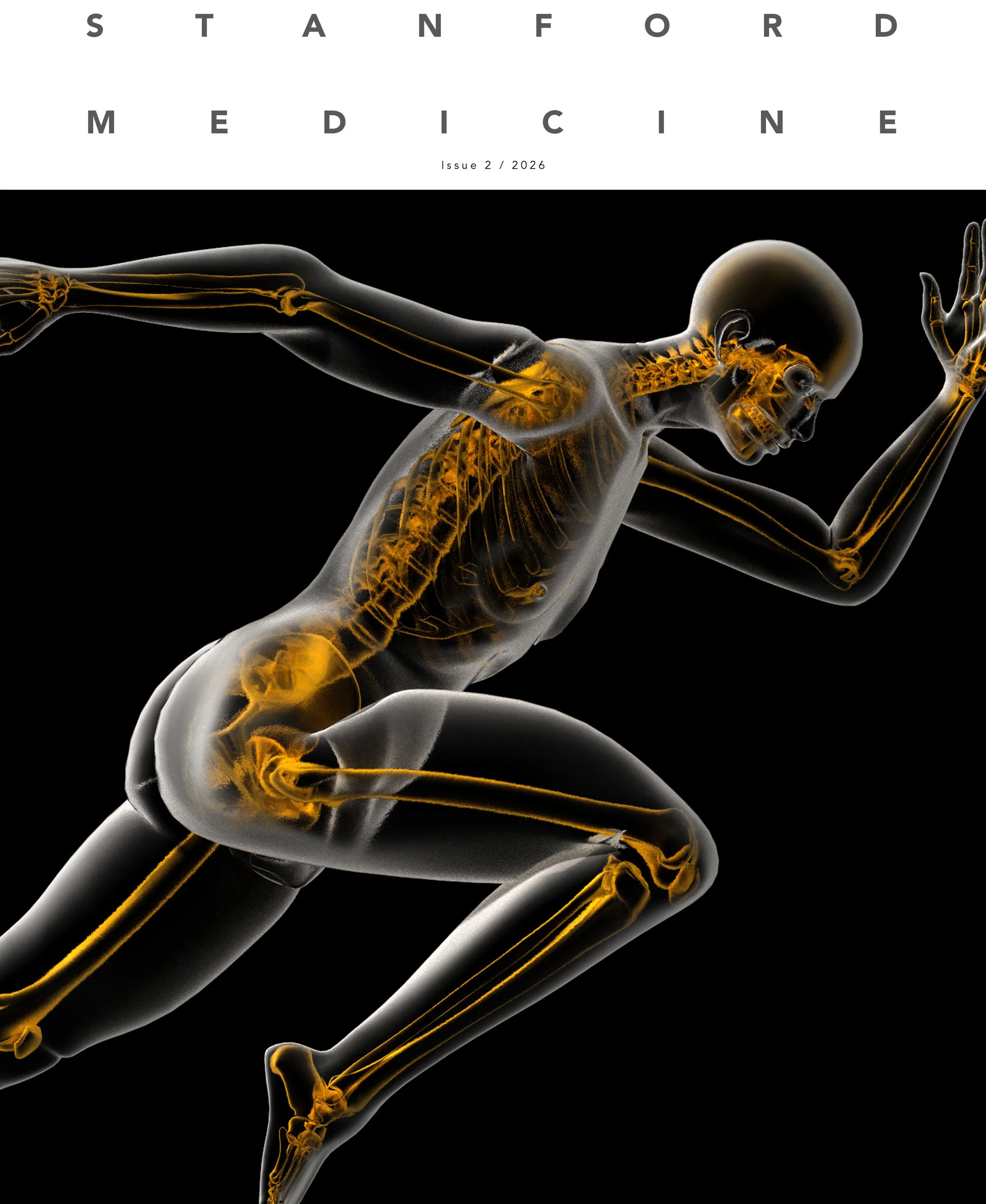
In June 2026, David Armario reached out to me to see if I was interested in working on a cover and full-spread illustration for the upcoming issue of Stanford Medicine. He explained it was for a special issue on joints, ligaments, tendons, and movement. I always love working on figures and covers, so of course I said yes.
He asked that I show a figure with the joints and skeletal system highlighted and sent me this blank template of the cover:
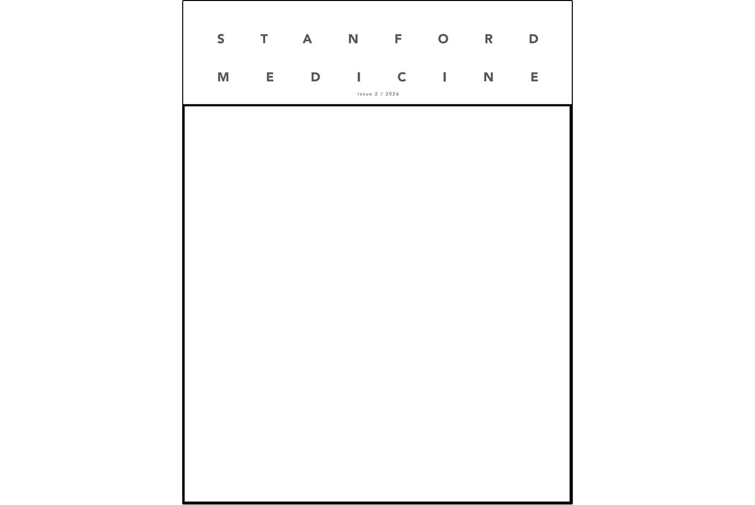
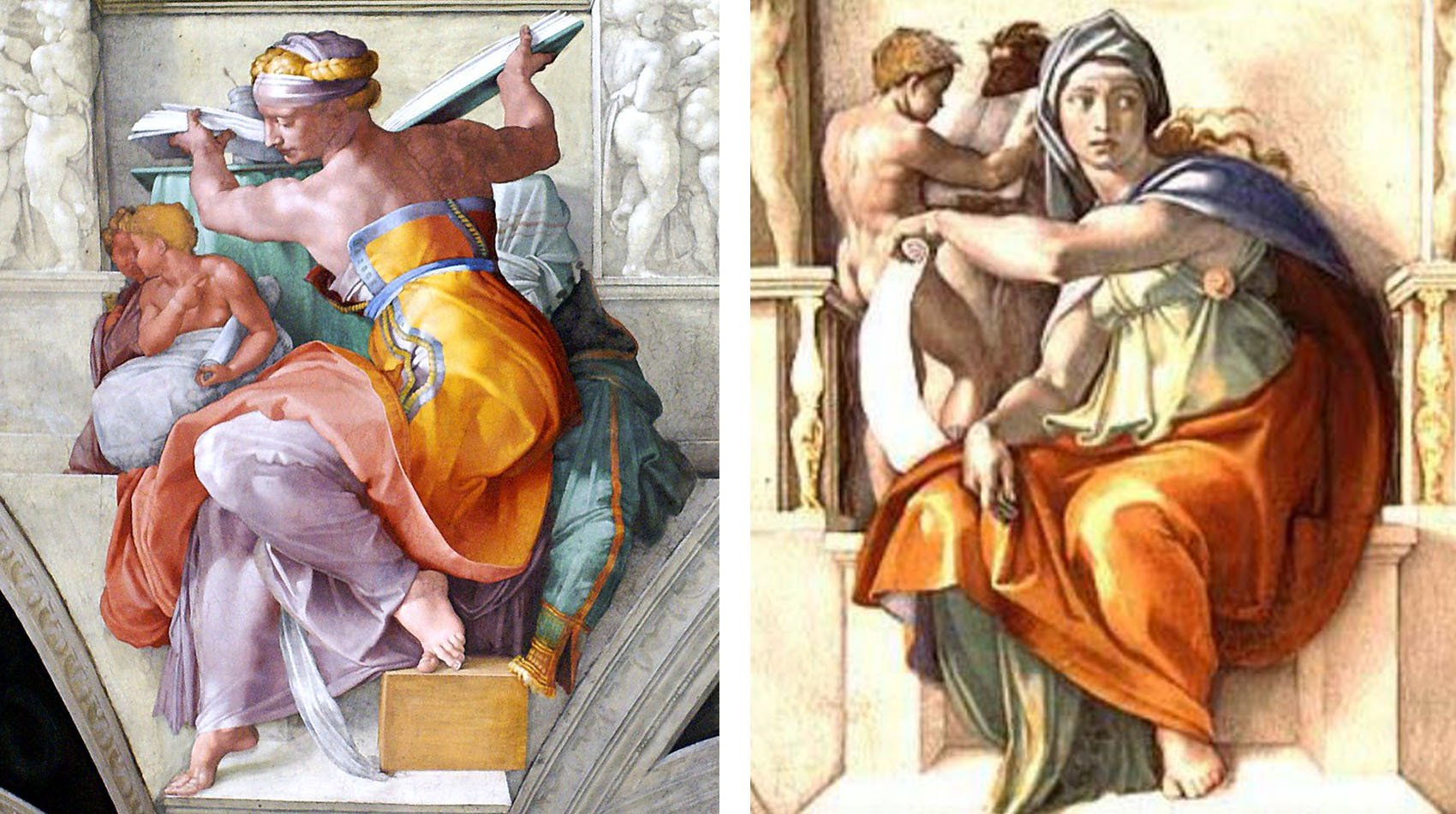
A square is one of the more challenging proportions to work with. As I started sketching rough ideas, I realized I was wanting to really fill that square, make it like the figure was living in this square — or maybe cubic space, in a sculptural sense. For years, I’ve loved Michelangelo’s sibyls on the Sistine Chapel ceiling. These are incredible examples of what I’m talking about:
I put together a few options, including one that didn’t fill the space quite as much but maybe had more movement. Here are the initial sketches I sent:
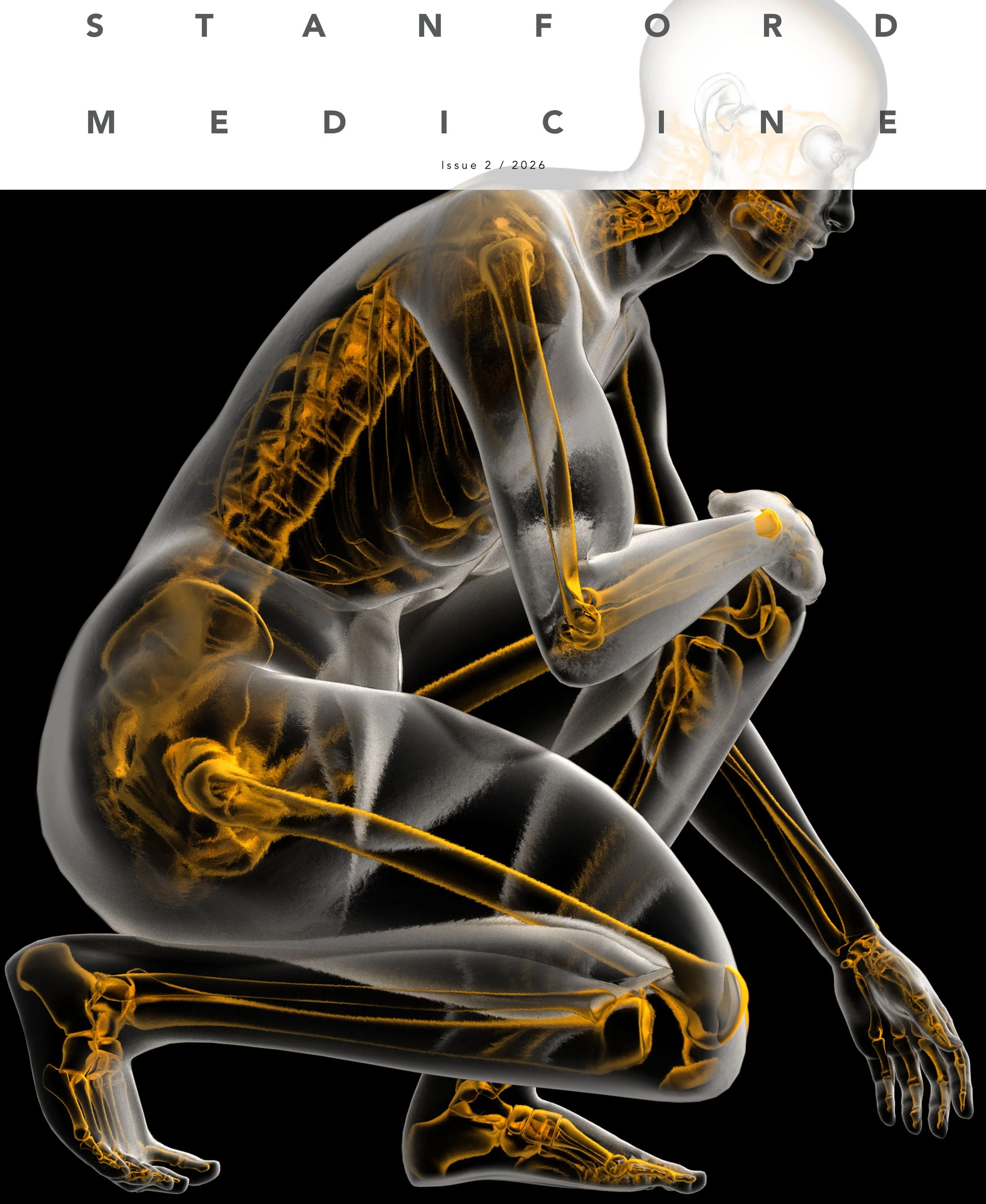
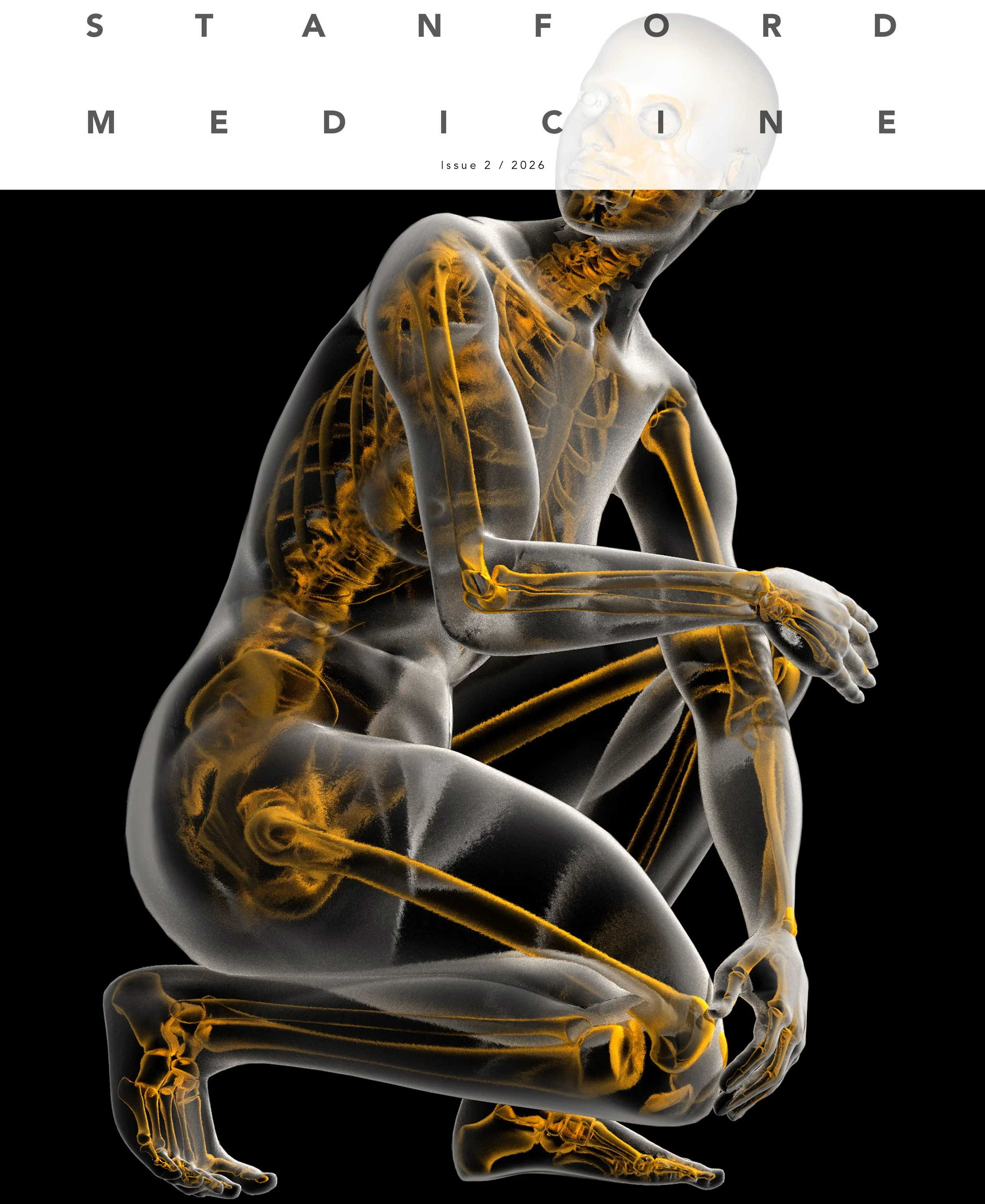
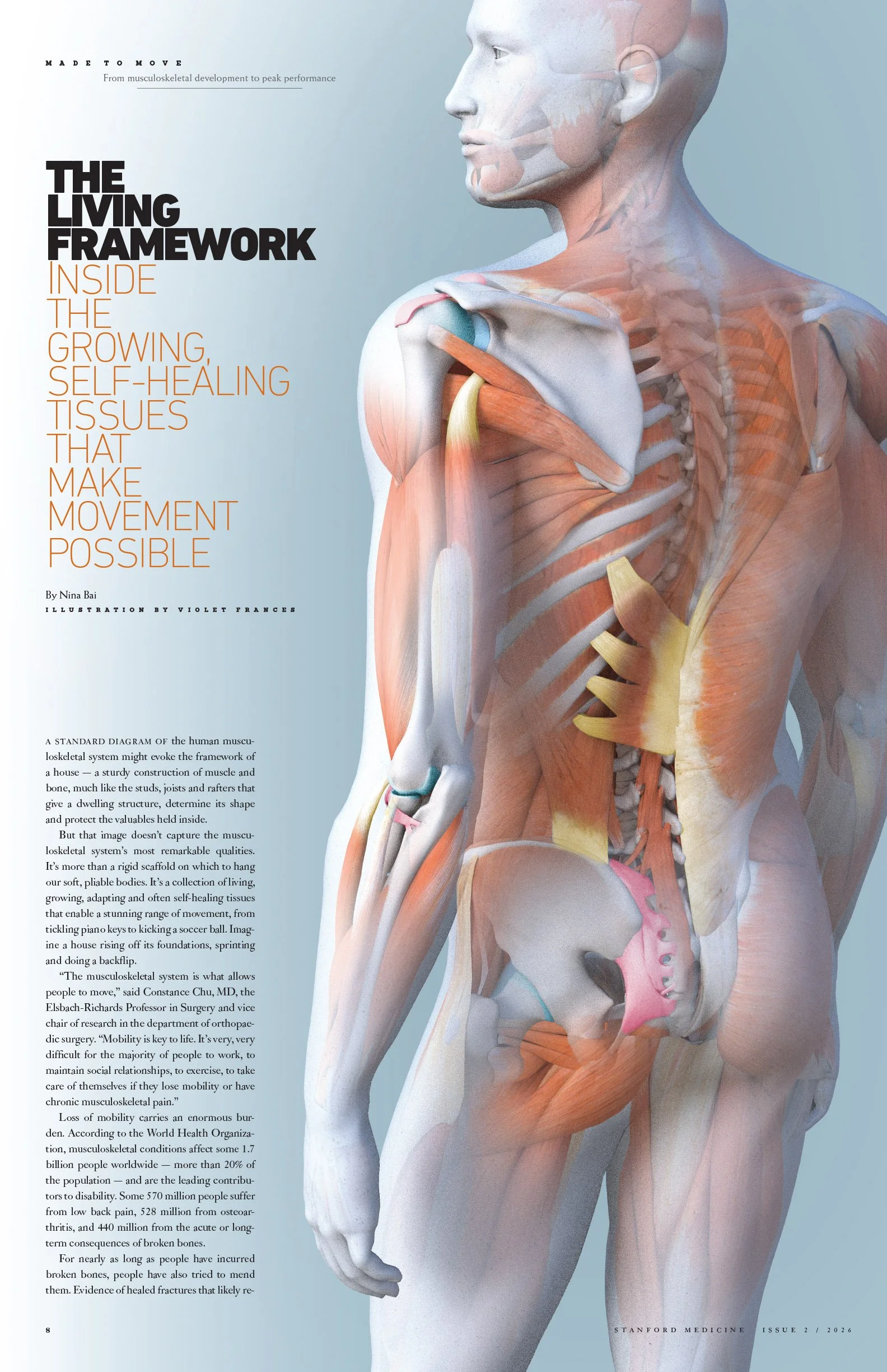
After sending the sketches, I moved on to the full-spread illustration. The ask was pretty straightforward: show a figure from the back, making visible the skeletal system, muscular system, and tendons and ligaments.
I posed a figure, chose an angle to shoot it from, and sent in this rough sketch to get David’s feeling on this direction:
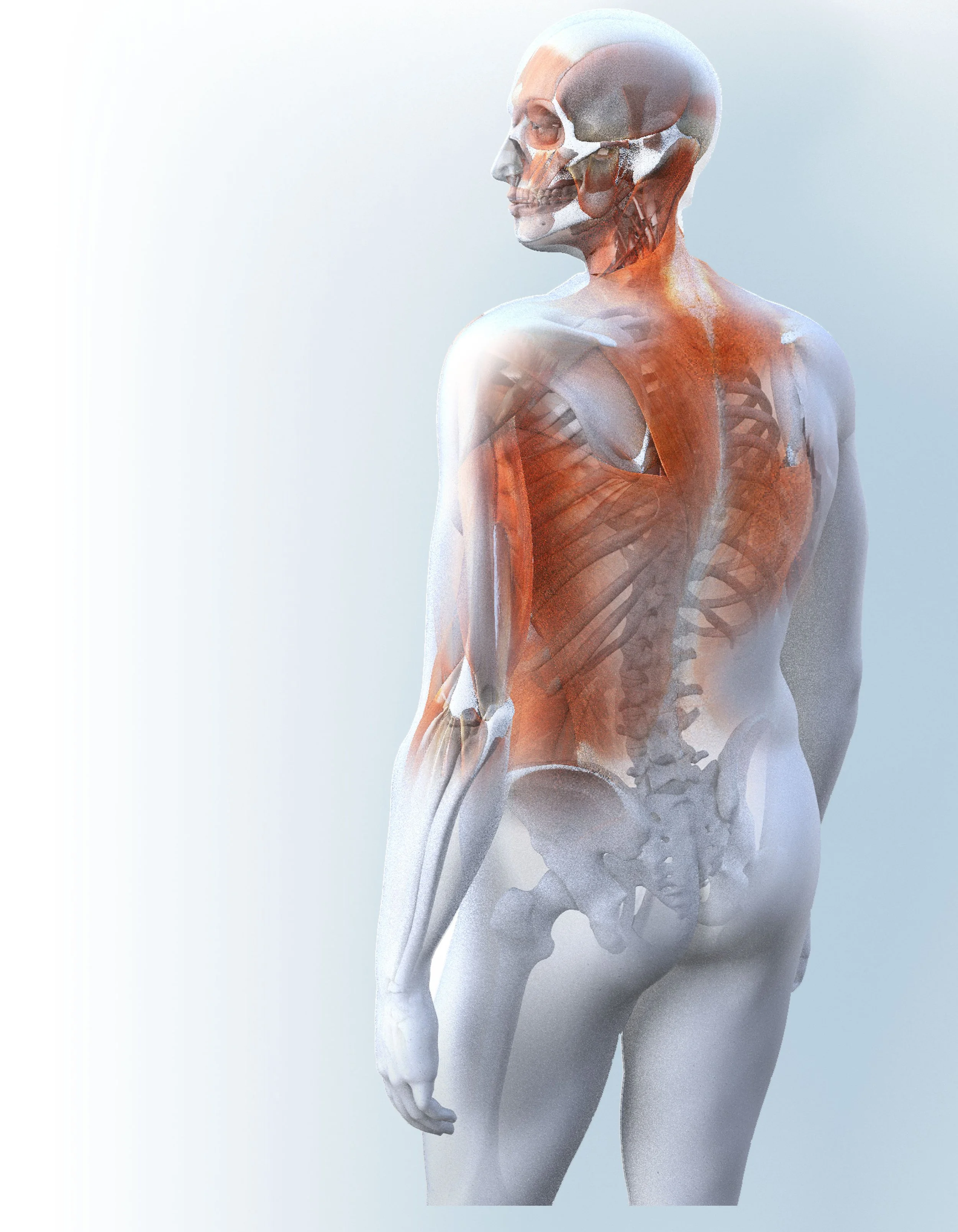
David was so pleased with the direction these two were headed in that he asked if I’d be interested in working on a couple more inside spreads.
Sometimes I’m given a very specific brief, a very clear sketch to work from. In this case, I was handed a few articles and told do something with them.
I enjoy working in both manners; each has its own challenges and advantages from my perspective as an artist and illustrator. As I’ve said elsewhere, the collaboration is probably my favorite component of my work. But this “collaboration” takes various forms. In this case, the collaboration was of the latter kind. There’s something challenging about this — a fear of a blank canvas, so to speak — yet I do love and often thrive in the openness of this kind of commissions. And this type of collaboration tends to lead to more sketches than usual.
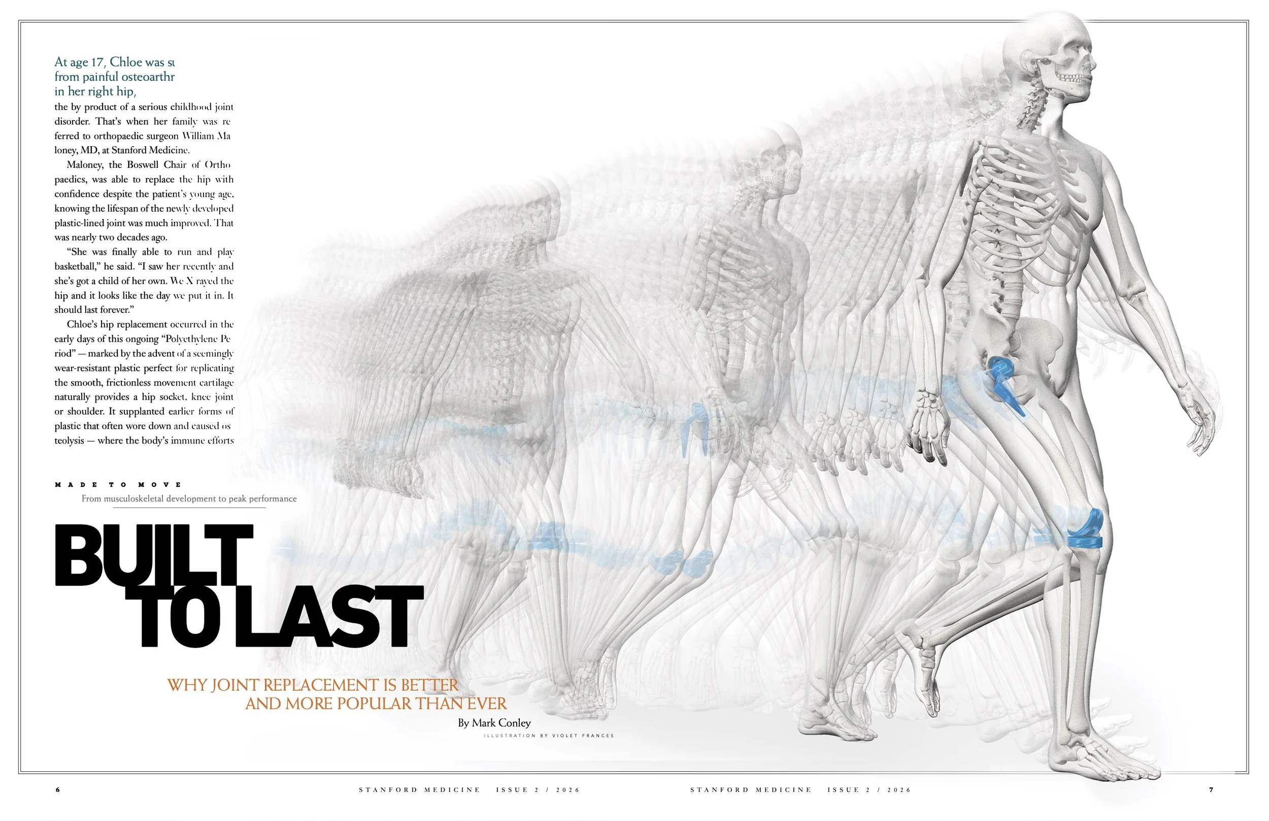
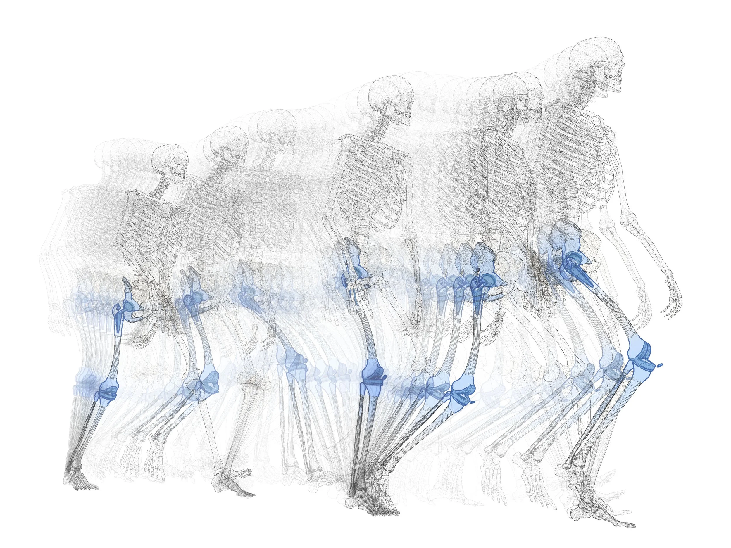
The third piece was on joint replacement. The story referenced four specific technologies being developed and studied. But in our talks, David had stressed that the idea of movement was critical. So I decided that, rather than show a large replacement, I’d focus on the movement and have the joint replacements be an ancillary part of it. I sent him something my old studio, Bryan Christie Design, had done a few years back for National Geographic on animal locomotion and asked if he was interested in trying something in this direction:
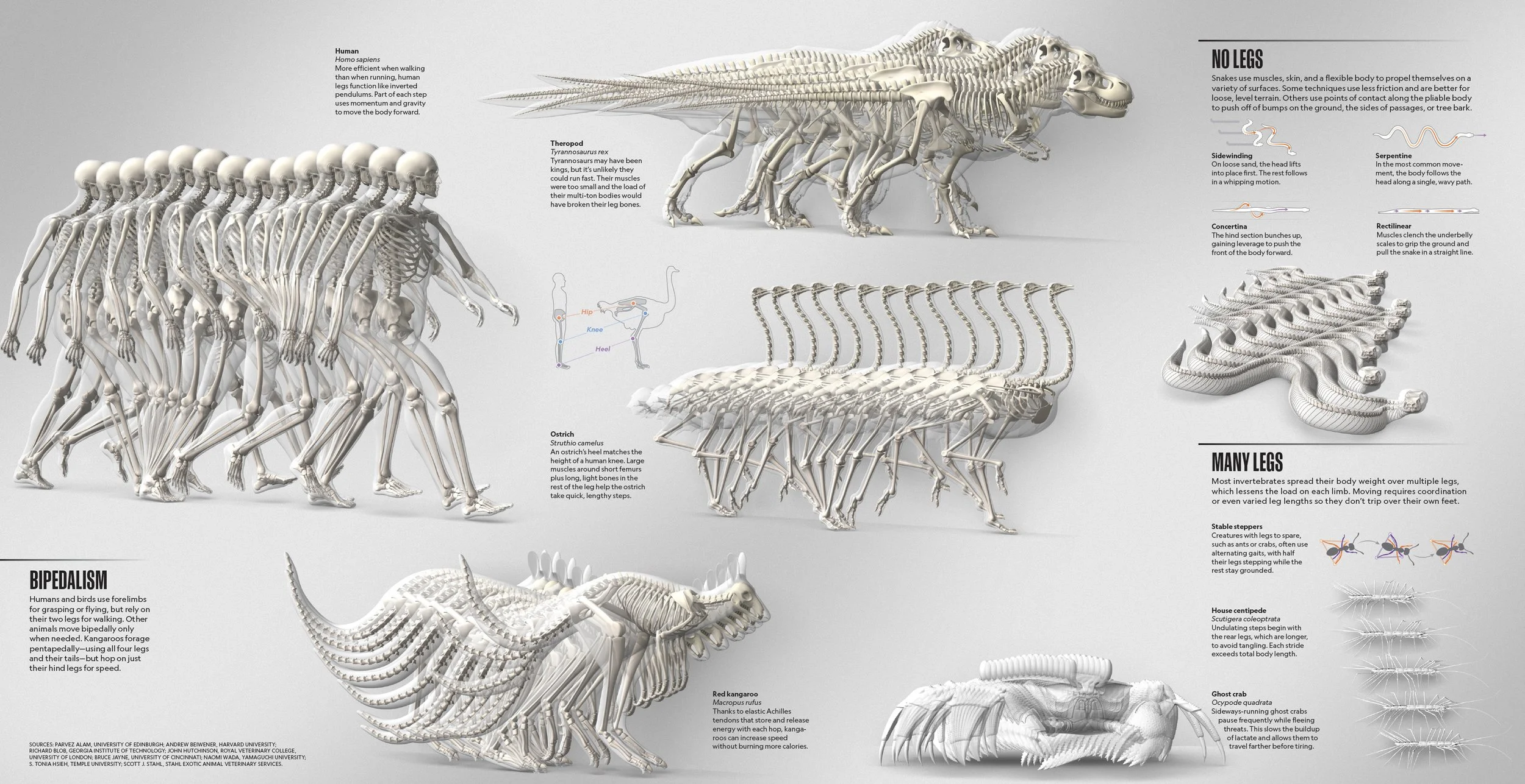
He replied in the affirmative, and I got to work. Lately I’ve been doing quite a few pieces with multiple exposures like this. This idea of multiple exposures also relates to my silk-and-encaustic work. I’m very interested in honoring the flat medium of illustration while also attempting to bring movement and dimensionality without the typical uses of perspective and shading. A bit of a Cubist take on it, if only in intent.
Here are the initial sketches I sent. As you can see, I tried a line-work version and a more shaded version. I also thought it might be nice to zoom in on the lower half of the figure, so I supplied a version like that:
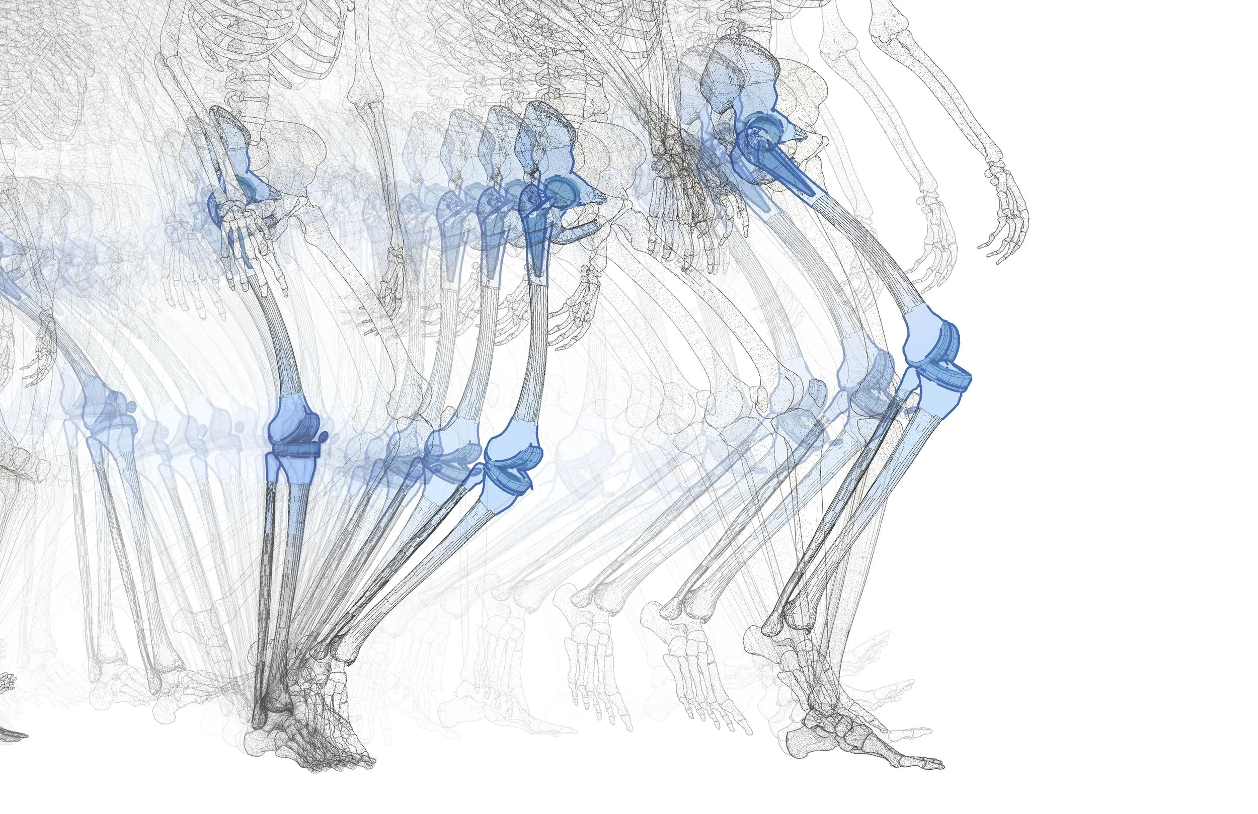
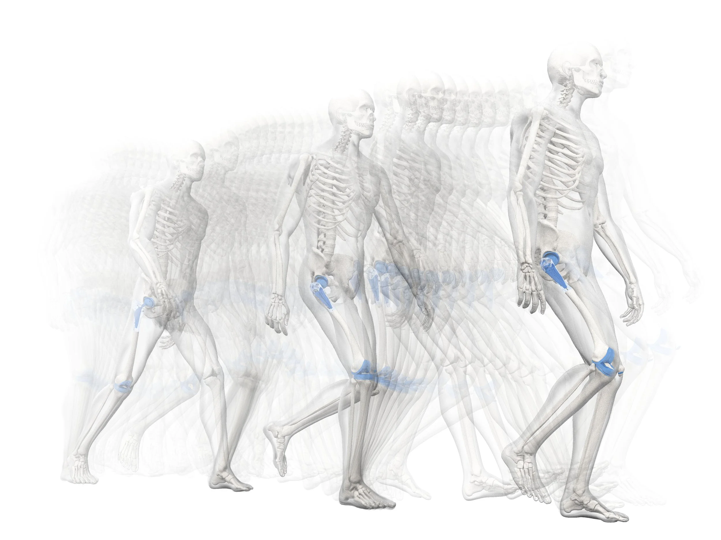
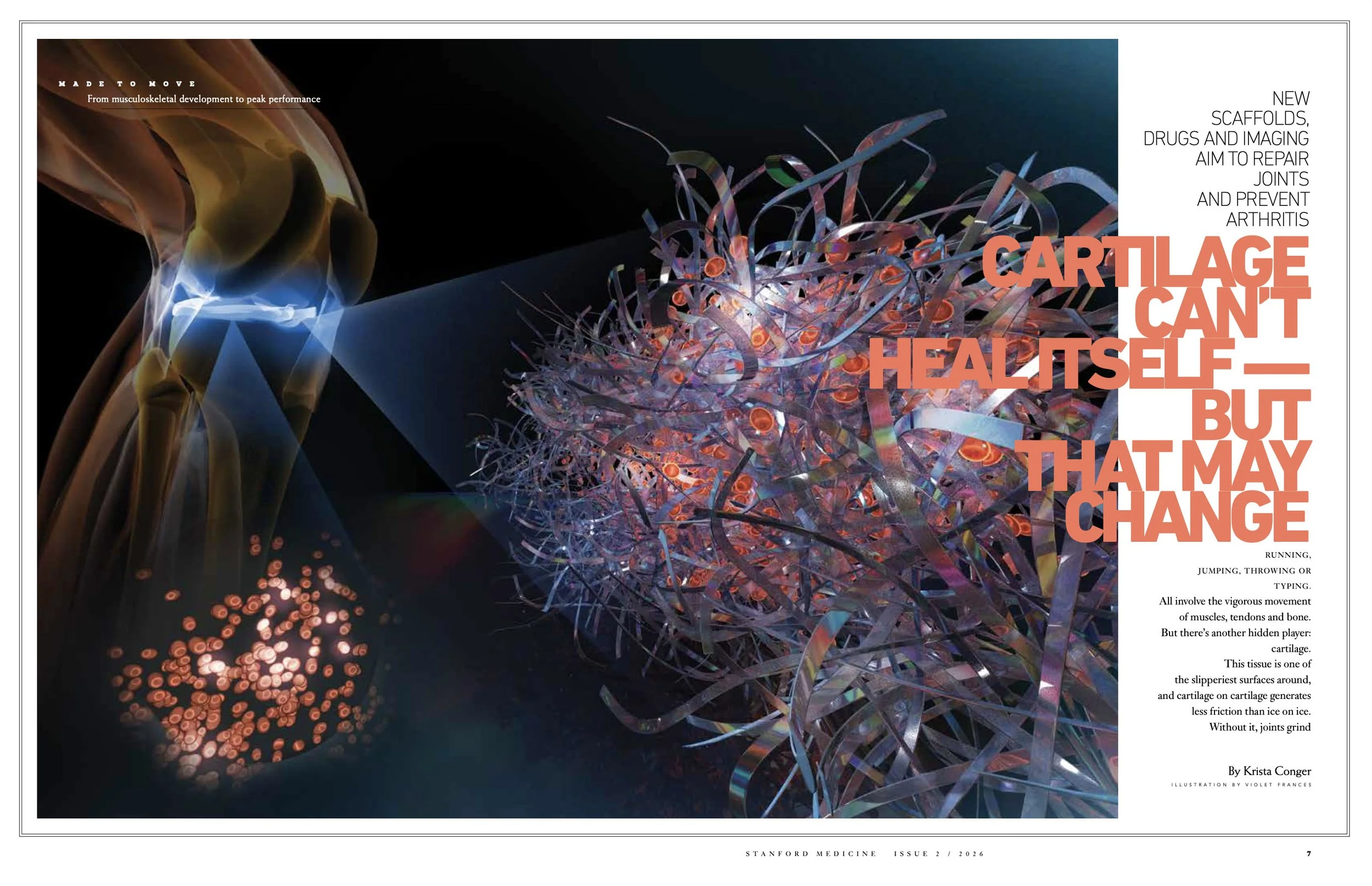
The fourth project was the most challenging . The story was about new technologies to treat osteoarthritis. There were a few different technologies, and the work is so new that illustrating them was proving to be challenging, so I suggested we take a more conceptual approach with the piece and mocked up this sketch:
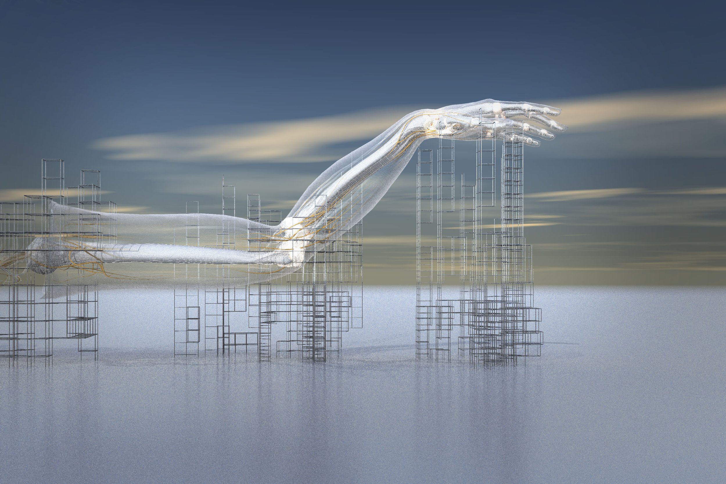
David was thrilled with this direction, and I breathed a sigh of relief. But a week later, David emailed to tell me that the editors didn’t share our enthusiasm for this approach.
I was a bit disappointed but took a deep breath and started again.
I wasn’t sure how I could do it with the information I had, but I thought it would be good to try one scene that incorporated all the technologies. I wasn’t exactly sure how I could do it so that it was accurate. But I held my breath and sent this sketch — with the caveat that I would need a lot of direction and guidance in order to make it work:
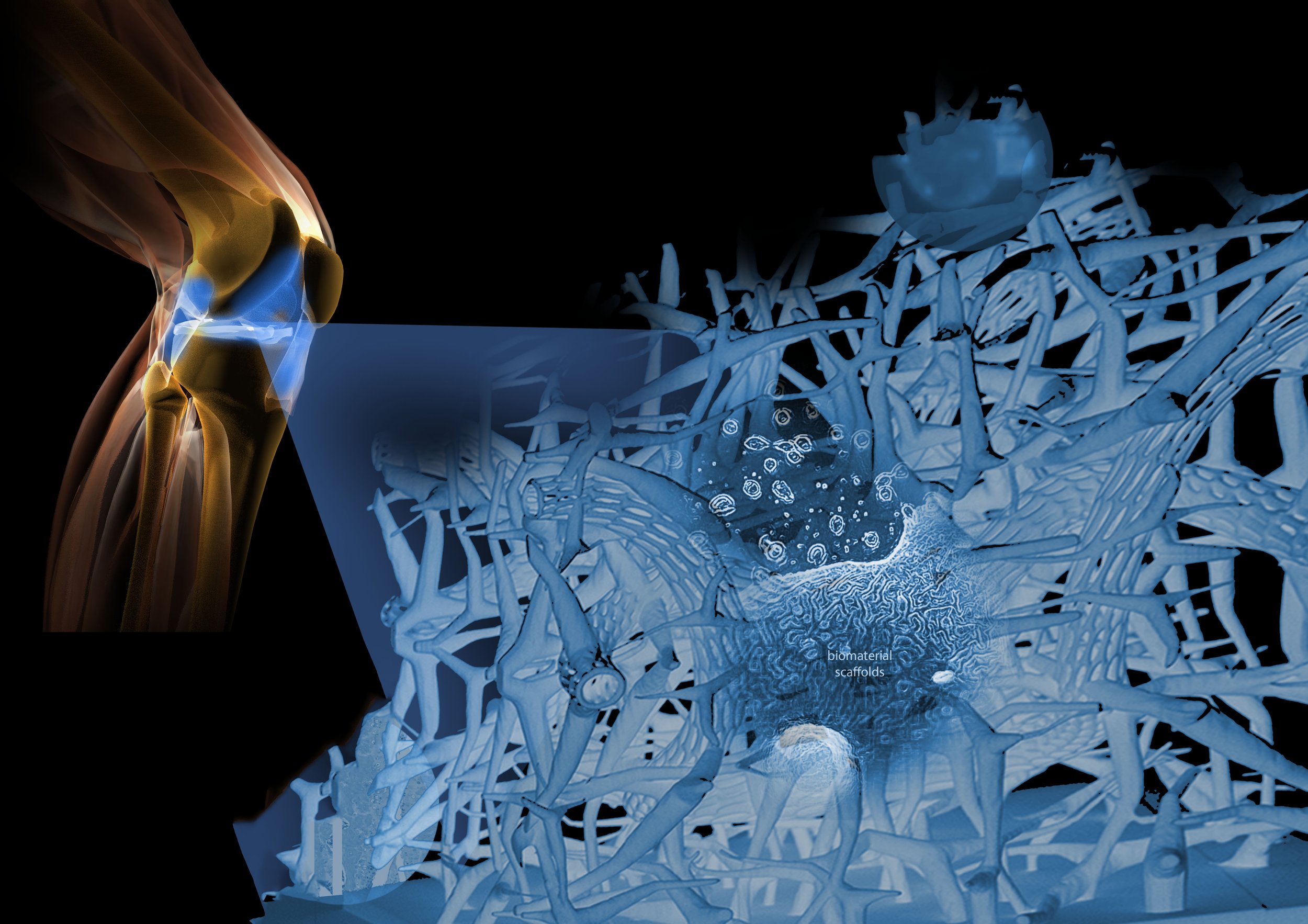
The editors were enthusiastic about this approach. And after a number of emails with the editors and scientists, I proceeded to final. Here are the four final illustrations as they appeared in the magazine: